RSG Profile Manufacturing
A steel factory judged against an IndiaMART listing, by buyers who will never use a checkout.
- Role
- End-to-end UX/UI & Development
- Timeline
- 6 weeks
- Status
- Live at rsgprofilesheets.com
- Platform
- B2B site + lead capture + CMS
- Industry
- Steel & roofing manufacturing
Project overview
- What it is
- Redesign + replatform — WordPress → custom build. B2B manufacturer site, lead capture, CMS
- The company
- RSG Profile Manufacturing — manufacturer and wholesaler of colour-coated roofing sheets, decking, purlins and structural steel, Kanpur, Uttar Pradesh
- Industry
- Steel & roofing manufacturing
- My role
- Sole designer & developer — research, IA, design system, UI, copy, frontend, backend, admin
- Team
- Solo
- Stack
- Next.js App Router · React · TypeScript · Tailwind 4 · Express · MySQL · Tiptap
- Status
- Live at rsgprofilesheets.com
Who it's for, and how they arrive
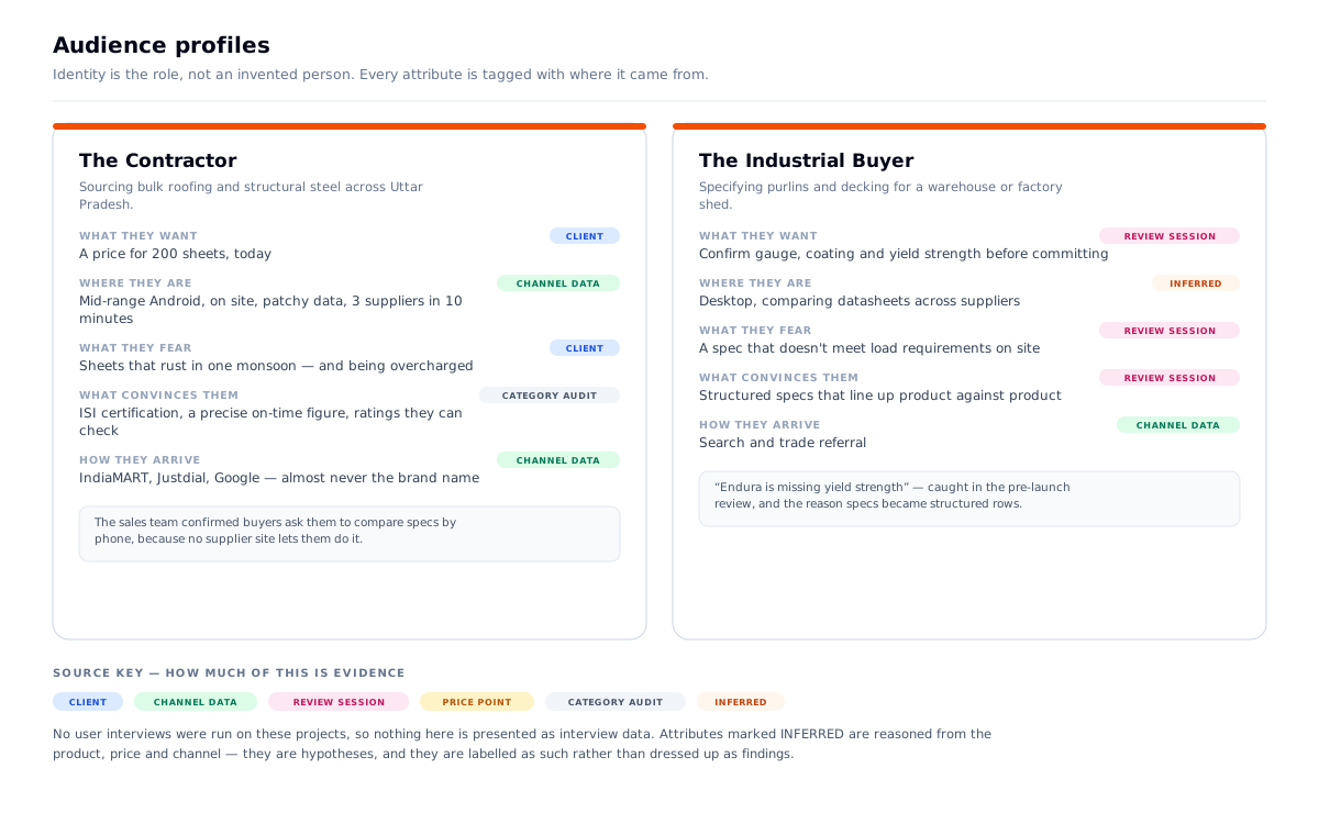
Primary user: a contractor or builder sourcing roofing and structural steel in bulk across Uttar Pradesh. Buys on price, certification and whether the seller looks real. Often standing on a site while doing it.
Secondary user: an industrial buyer specifying purlins and decking for a warehouse or factory — more technical, comparing on gauge, coating and load.
Third user: a homeowner re-roofing a house, buying once, and nervous about being overcharged.
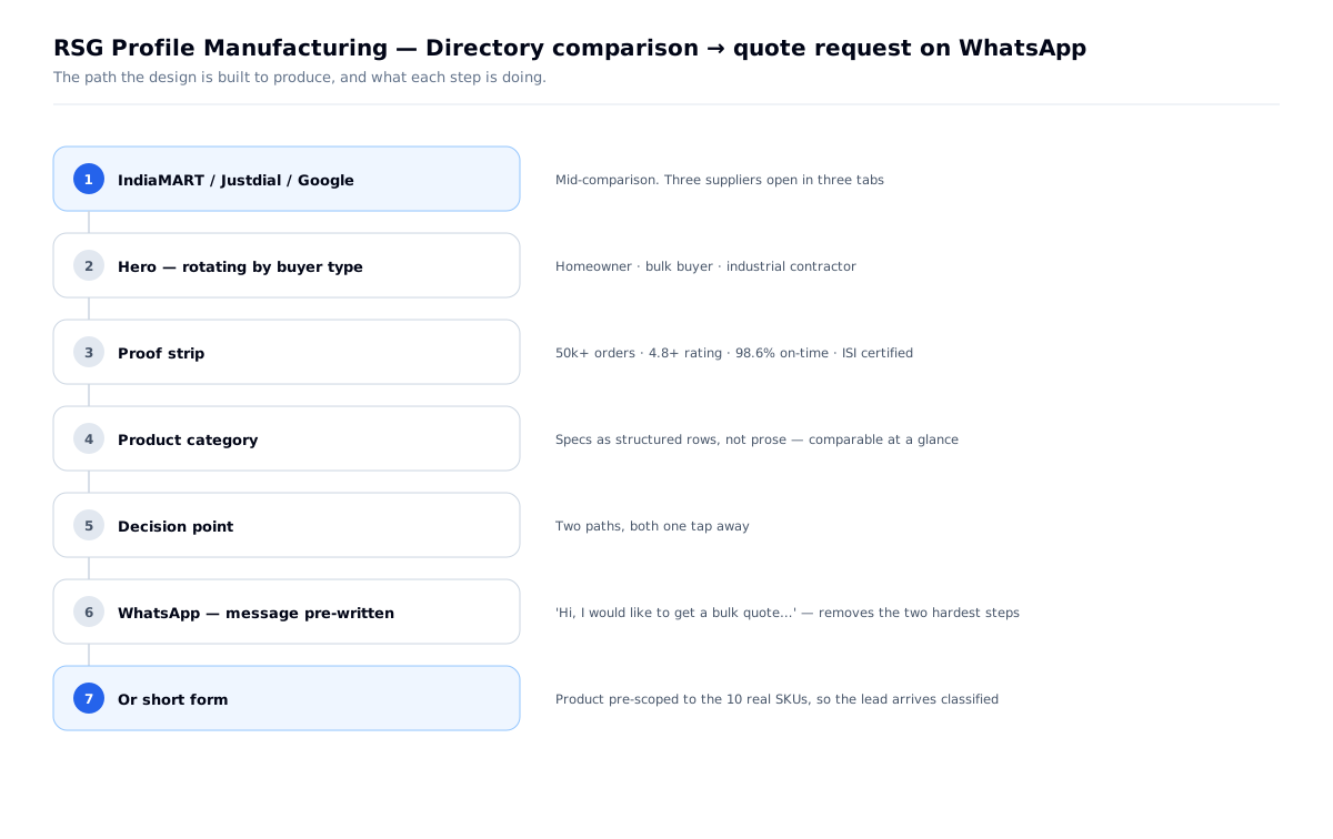
How they arrive: IndiaMART, Justdial and Google — plus word of mouth. Almost nobody types the brand name.
The one action: request a quote on WhatsApp. Not a purchase.
The context: mid-range Android, patchy site data, comparing three suppliers in about ten minutes.
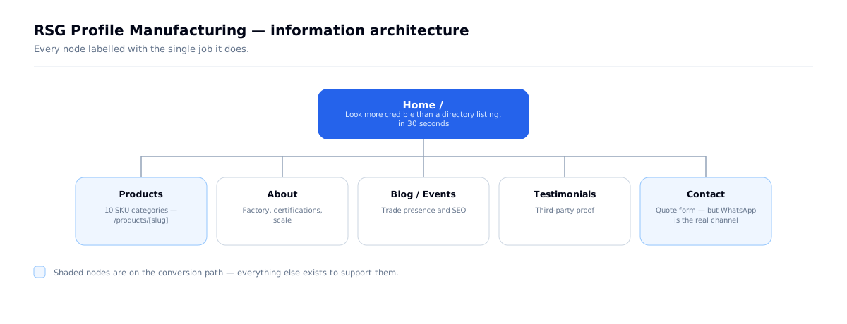
The competitive frame is the whole insight. RSG isn't being compared to other manufacturer websites. It's being compared to a directory listing — a page with a phone number, some grainy photos and a star rating. So the brief becomes: be more legible and more credible than an IndiaMART listing, in under thirty seconds, on a phone, without asking the buyer to change how they buy.
The problem
- Discovery happens on third-party directories, where every supplier looks identical
- The buyer transacts on WhatsApp and phone — a quote is a message, not a checkout
- Purchases are bulk and high-value; getting it wrong means a roof that rusts in one monsoon
- Trust is the deciding factor, and RSG had no way to show it beyond a listing
- The audience is on cheap phones and unreliable data
What I had to work with
- A real factory with real history — genuine proof was available, unlike a startup
- A catalogue of 10 SKU categories sold on technical specification, not on brand
- No existing digital presence to build on
- An audience with low tolerance for friction and no interest in learning a new buying process
- An existing site to replace — this was a redesign, not a new build
What was already there
The previous site was a WordPress page-builder template under a different brand mark. Three things about it set the brief:
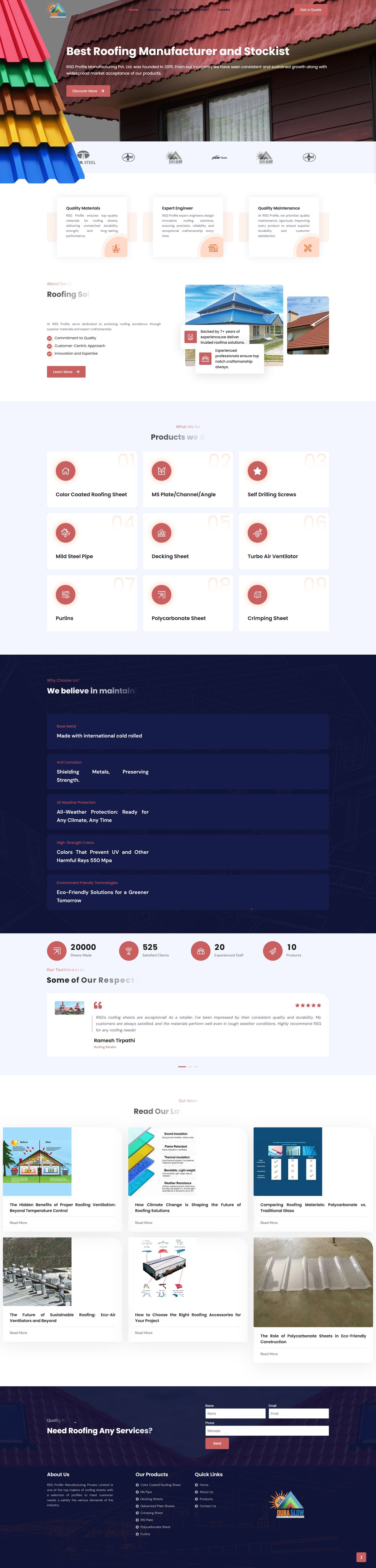
Section headings were rendering clipped. "Roofing Sol…", "Products we of…", "We believe in maintain…", "Read Our La…" — cut mid-word, in production, on the homepage. A visitor comparing three suppliers doesn't diagnose a CSS bug; they read it as a company that doesn't check its own work. On a purchase this size, that is the whole decision.
Product cards carried decorative numerals 01–09 that collided with the labels — so the one thing the page needed to communicate, what do you actually sell, was the hardest thing to read.
Nothing was comparable. Products were presented as prose blocks, so a buyer choosing between two sheets couldn't line up thickness, coating and strength.
That third problem is the one that shaped the build: the redesign's job was to make the catalogue comparable, and everything else followed from it.
Research & definition
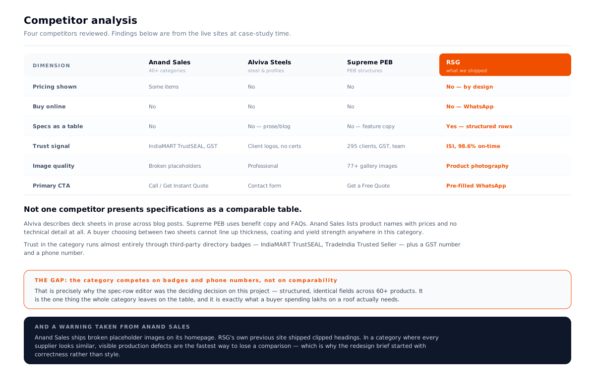
I reviewed four suppliers the same buyer would be comparing RSG against: Anand Sales, Alviva Steels, Maruti Profile and Supreme PEB.
The finding that decided the build: not one of them presents specifications as a comparable table. Alviva describes deck sheets in prose spread across blog posts. Supreme PEB uses benefit copy and FAQs. Anand Sales lists product names and prices with no technical detail at all.
A buyer choosing between two sheets cannot line up thickness, coating and yield strength anywhere in this category — which is why they end up phoning three suppliers to ask. RSG's own sales team confirmed exactly that in the review session.
The second finding: trust in this category runs almost entirely through third-party directory badges — IndiaMART TrustSEAL, TradeIndia Trusted Seller — plus a GST number and a phone number. That's borrowed credibility, and it's available to every competitor equally.
And a warning. Anand Sales ships broken placeholder images on its homepage. RSG's previous site shipped clipped headings. In a category where every supplier looks alike, visible production defects are the fastest way to lose a comparison — so the brief started with correctness before style.
The problem statement this produced
Every supplier in this category is enquiry-only, badge-backed and impossible to compare. Win by making the catalogue comparable — and by not shipping anything visibly broken.
Problems → decisions
| # | The problem | What I decided | Why | What it changed |
|---|---|---|---|---|
| 01 | Instinct says build e-commerce | Built no cart, no accounts, no payments | This audience transacts on WhatsApp; asking them to stop taxes the seller | Removed an entire subsystem; the site became a credibility layer, not a channel |
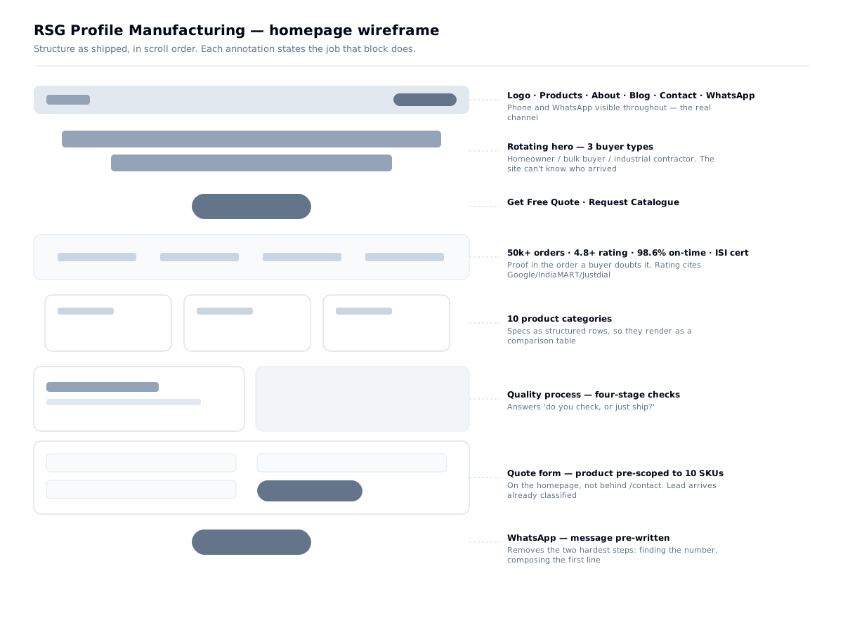
| 02 | Asking for a quote has friction | Pre-written WhatsApp message on every CTA | Removes the two hardest steps: finding the number, composing the first line | One tap from "I want a price" to "I've asked" |
| 03 | "Is this seller real?" | Proof stated as specific numbers, citing third parties | Checkable beats impressive | Rating cites Google, IndiaMART and Justdial by name |
| 04 | Steel is bought on numbers | Specs stored as structured rows, not prose | Renders as a comparison table and stays consistent across 60+ products | A data-modelling decision that shows up as design quality |
| 05 | Forms fail on bad connections | Every failure path routes to WhatsApp | The buyer hardest to win is the one with two bars of signal | Even a 429 gets an honest message and a human fallback |
| 06 | 11th component invents its own values | A living style guide, 404'd in production | Built from the real components, so it can't drift from reality | /style-guide as a working tool, not a public artefact |
Design principles, set before any screen
- Meet the buyer's existing behaviour. They buy on WhatsApp; the site's job is to earn the message, not replace it.
- Every proof number must be checkable or precise. 98.6%, not "reliable".
- Specs are data, never prose. Steel is bought on numbers.
- Design the failure states first. The buyer with two bars of signal is the one worth keeping.
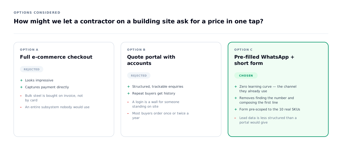
How might we let a contractor on a building site ask for a price in one tap?
The obvious brief for a manufacturer site is e-commerce, or at least a quote portal with accounts. I built neither.
This audience transacts on WhatsApp, and asking them to stop is a tax on the seller, not the buyer.
What shipped instead:
- A persistent floating WhatsApp button on every page
- Quote CTAs that open WhatsApp with the message already written:
"Hi, I would like to get a bulk quote for roofing and steel materials." - A short form for buyers who prefer typing — on the homepage, not behind a
/contactlink - The phone number visible in the header throughout
Why: every step between I want a price and I have asked for a price loses buyers. A pre-filled message removes the two hardest ones at once.
What I rejected: a full quote-and-checkout flow. It would have looked more impressive in a portfolio and been used by nobody.
Impact: the site's job narrowed usefully — it isn't a sales channel, it's a credibility layer in front of a WhatsApp conversation. That reframing cut a large amount of speculative scope.
What I learned: meeting users where they already are usually beats building somewhere better.
Decision 01 — Proof as numbers, in the order a buyer doubts them
Two choices worth naming:
The rating cites the directories by name. That borrows the trust of platforms the buyer already uses — and, critically, it's checkable. An uncheckable rating is worth less than no rating.
"98.6% on-time" instead of "reliable delivery." An odd, precise number reads as measured; a round one reads as claimed. Same discipline as Falcon: a specific figure you can defend beats a comfortable one you can't.
| Claim | The doubt it answers |
|---|---|
| 50k+ orders delivered | Have you done this at scale? |
| 4.8+ rating across Google, IndiaMART, Justdial | Do people who actually bought agree? |
| 2–3 day delivery Pan-UP, 98.6% on-time | Will it arrive when you say? |
| ISI-certified, batch-logged, salt-spray tested | Will it survive a monsoon? |
| Four-stage quality checks before dispatch | Do you check, or just ship? |
Decision 02 — An industrial system, and a palette that got tighter
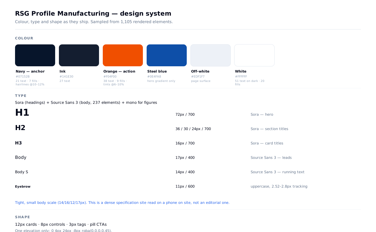
Sampled from the live DOM across 1,105 rendered elements.
Type: Sora for headings — h1 72px/700, h2 36 / 30 / 24px, h3 16px — and Source Sans 3 for body, 237 elements — and a mono face for figures. The body scale is tight and small (14/16/12/17px) because this is a dense specification site read on a phone, not an editorial one. Uppercase eyebrows are tracked to 2.52–2.8px — at small sizes on a bright ground, that spacing is what separates a label from a cramped word.
Shape: 12px cards, 8px controls, 3px tags, pill CTAs. One elevation.
The token file says eight colours. The site ships four.
The source palette also defines cyan #00B4DB and gold #FFA820. Sampling the live page, neither appears in meaningful use — they survive only inside the hero gradient.
I could present the eight-colour palette. It would look more impressive and it would be false. What shipped is a four-colour system: navy for authority, ink for text, one orange for every action, off-white to sit on. A palette gets disciplined by contact with real pages, and the version that survived is the better one.
(This is a real inconsistency, not a feature — the token file should be trimmed to match.)
Why navy and orange: the colour of the material and the colour of a warning. And deliberately not the blue that every industrial-services site defaults to — including two other projects in this portfolio.
| Role | Value | Live usage |
|---|---|---|
| Navy — the anchor | #07152B | 21 text, 7 surfaces, hairlines at 10–12% |
| Ink | #141E30 | 27 text |
| Orange — the only action colour | #F04F00 | 38 text, 9 surfaces, tints at 6–10% |
| Off-white | #EDF1F7 | page surface |
| White | #FFFFFF | 51 text on dark, 20 surfaces |
Decision 03 — A living style guide, gated out of production
export default function StyleGuidePage() {
  if (process.env.NODE_ENV === 'production') {
    notFound();
  }
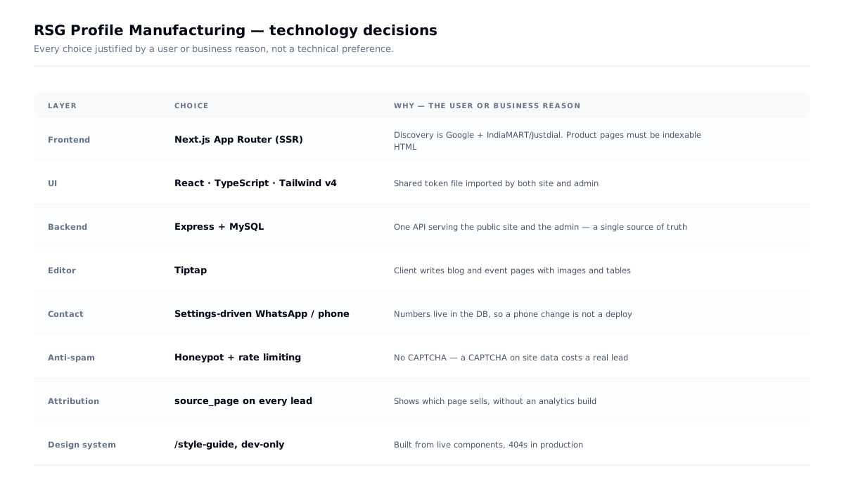
/style-guide renders the palette with hex values, the type scale, and every button and card variant — built from the same components the site uses, so it can't drift the way a static spec does. It 404s in production, so it's a working tool rather than a public artefact.
Why it mattered here: product pages, blog, events, testimonials and an admin, built over six weeks. Without one screen where the system is visible at once, the eleventh component quietly invents its own values.
Decision 04 — Designing the failure states
These are the decisions that show whether someone thought about the site running unattended for years.
The quote form scopes itself to the catalogue. The product dropdown lists the ten real SKU categories plus "General Inquiry", so a lead arrives already classified and sales isn't decoding "need sheets" into a product line.
Every submission carries source_page. The client can see which page produces quotes without an analytics build.
Spam is handled invisibly — a honeypot field plus server rate limiting. No CAPTCHA: a CAPTCHA on a contractor's phone on site data is a lost lead.
When the form fails, it hands the buyer to WhatsApp:
"Something went wrong. Please WhatsApp us or call directly."
Including on a 429, which gets its own honest message rather than a generic error.
And when the backend is down, the page still renders. The layout catches the settings fetch failing and hides the WhatsApp button while everything else loads — an API outage degrades one feature instead of blanking the site.
What I learned: on a lead-generation site, the error states are the product. A form that fails silently on a bad connection loses exactly the buyer who was hardest to get.
Validation — what the review session changed
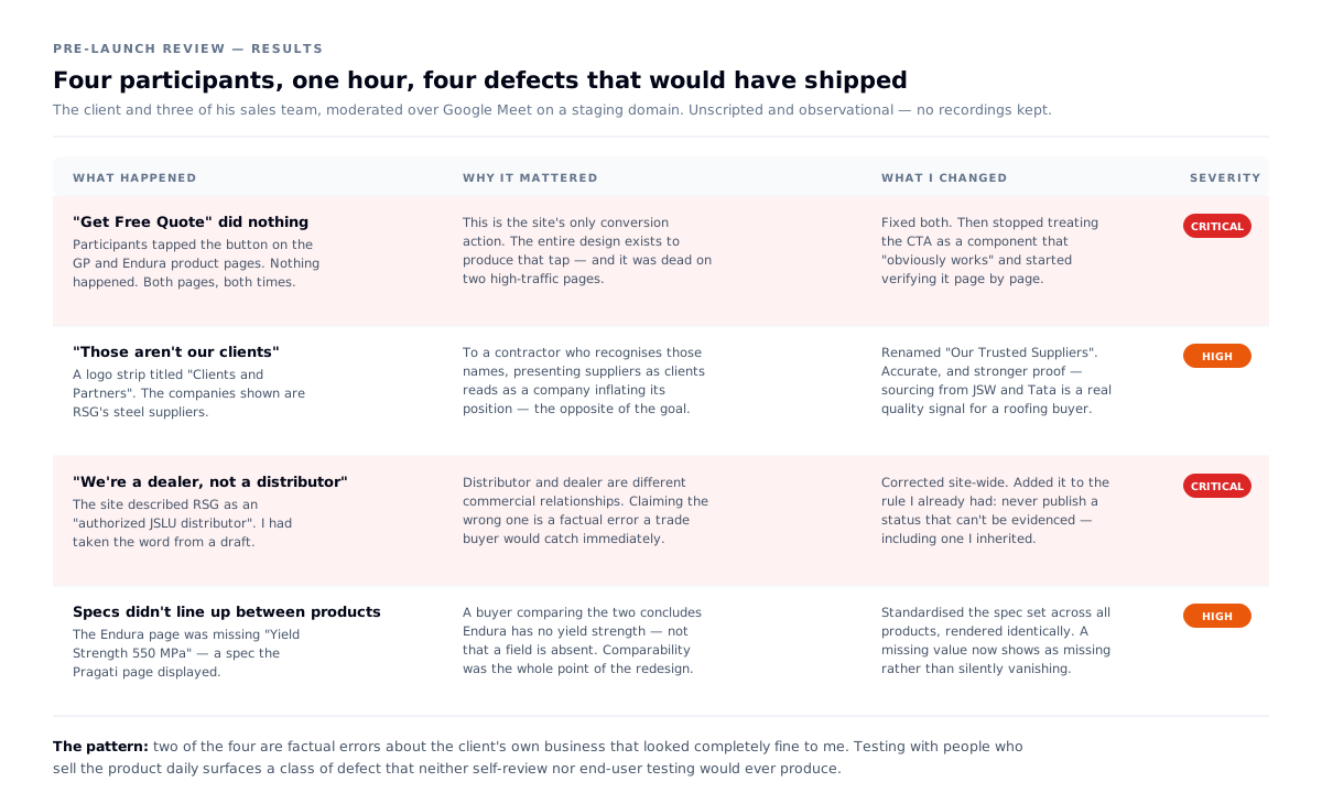
Before launch I put the build on a temporary domain and walked four people through it over Google Meet: the client and three of his team, all of whom sell this catalogue daily. Unscripted and observational — I gave them the link and real tasks, then watched. No recordings or formal notes were kept, so what follows is what changed as a result rather than a write-up of a protocol.
It was the most useful hour of the project, because these four know things about the business that no amount of desk research would have surfaced.
Four findings, and what each one changed
1. "Get Free Quote" was broken on two product pages. The buttons on the GP and Endura pages did nothing. This is the site's only conversion action — the entire design exists to produce that tap — and it was dead on two of the highest-traffic product pages. Nobody found this by reading code; someone found it by trying to buy something. → Fixed, and I stopped treating the CTA as a component that "obviously works" and started checking it per page.
2. "Clients and Partners" was the wrong label — those companies are suppliers. I had built a logo strip and titled it the way logo strips are usually titled. The client pointed out that presenting your steel suppliers as your clients is not a small wording slip: to a contractor who recognises those names, it reads as a company inflating its position. → Renamed "Our Trusted Suppliers" — which is both accurate and stronger proof, because sourcing from JSW and Tata is a genuine quality signal for a roofing buyer.
3. The site claimed "authorized JSLU distributor". They are a dealer. Distributor and dealer are different commercial relationships. I had taken the word from a draft and not questioned it. → Corrected everywhere. This is the same discipline as Falcon's rule against unverifiable claims — never publish a status you can't evidence — except here it took a domain expert to catch that I'd broken it.
4. Product specs weren't consistent between pages. The Endura page was missing "Yield Strength 550 MPa", which the Pragati page had. A buyer comparing the two would conclude Endura didn't have a yield strength — not that a field was absent. → This validated the spec-row editor decision and then hardened it: specs became a standardised set rendered identically on every product, so a missing value is visible as missing rather than silently absent.
What I learned: the four people who sell a product every day will find, in one hour, things no amount of self-review will. Finding 3 in particular is the kind of error only a domain expert catches — the page looked completely fine to me, and it was factually wrong. Testing with stakeholders who know the business is not a lesser substitute for user testing; for a B2B catalogue it surfaces a class of error that end users would never articulate.
The interface
The homepage hero rotates across three buyer types — homeowner ("Build the Home You've Always Imagined"), bulk buyer ("Built to Shelter What Matters Most"), industrial contractor ("Powering India's Industrial Backbone") — because the same catalogue serves three very different purchases and the site can't know which one arrived.
The admin
The client publishes and sells without a developer:
Catalogue with a spec-row editor · Content — blog, case studies, events, testimonials, guides, authors, categories, content calendar · Media library with upload, cropping and a picker · Leads with source page · Newsletter · Client logos · SEO · Settings · Users
The spec-row editor is the piece worth pointing at. Steel is bought on numbers — thickness, coating, width, length. Storing specs as structured rows rather than rich text means the same data renders as a comparison table and stays consistent across 60+ products.
The WhatsApp number itself is a setting, not a constant. It appears on every page and in every CTA; hard-coding it would have made a phone change a developer ticket.
Tech decisions, and why
Why leave WordPress. The deciding factor wasn't performance or taste — it was the spec-row editor. Steel is bought on numbers, so specs had to be structured fields rendered identically across 60+ products. In a stock WordPress editor that's a prose blob; getting structured, repeatable, comparable fields means custom post types plus a builder plugin plus template overrides — more bespoke work than building it directly, on top of a plugin surface the client would then have to keep patched for years.
And the one I didn't build: no cart, no accounts, no payments. The sale happens on WhatsApp and by invoice. Checkout would have added an entire subsystem nobody would use — the time went into specs, proof and failure states instead.
Outcome
- A live manufacturer site covering 10 product categories, blog, events and testimonials, server-rendered for search and directory traffic
- Lead capture with source attribution, invisible spam handling, and a WhatsApp fallback on every failure path
- A four-colour, two-typeface system with a living style guide
- A client who edits products, specs, content and contact details without a developer
- Delivered solo in six weeks
What I learned
The competitor isn't always another website. Designing against an IndiaMART listing produced a different — and correct — set of priorities.
Don't move the transaction. The most valuable decision was refusing to build the thing that would have looked most impressive.
Precise numbers outperform round ones. 98.6% is believable in a way "reliable delivery" never is.
A palette earns its size. Eight colours were defined; four survived contact with real pages.