Falcon Fire Safety
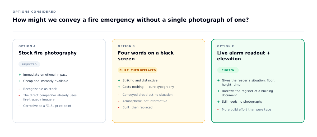
Selling a life-safety device online, for a company nobody had heard of.
- Role
- End-to-end UX/UI & Development
- Timeline
- 4 weeks
- Status
- Live at falconfiresafety.in
- Platform
- D2C e-commerce + operations admin
- Industry
- Fire safety manufacturing
Project overview
- What it is
- D2C e-commerce storefront + full operations admin
- The company
- Falcon Fire Safety — a first-year Indian manufacturer of the Firefly F-21, a mechanical zero-electronics emergency descent device
- Industry
- Fire safety manufacturing
- My role
- Sole designer & developer — research, IA, UI, copy, design system, frontend, backend, admin
- Team
- Solo
- Stack
- Next.js 16 · React 19 · TypeScript · Tailwind 4 · Express · Prisma · MySQL 8 · Razorpay
- Status
- Live at falconfiresafety.in
Who it's for, and how they arrive
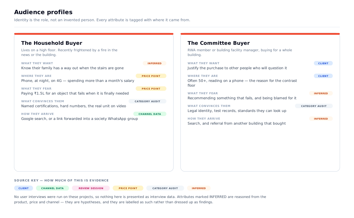
Primary user — the household buyer. Someone living on a high floor who has just been frightened by a fire in the news or in their own building. Often a parent. Not a safety professional.
Secondary user — the committee buyer. An RWA (residents' association) member or a hotel/facility safety officer, buying for a building. More informed, more sceptical, and frequently over 50, reading on a phone.
Third user — the client. The business owner who runs this alone after handover. Designed for explicitly (see the admin section).
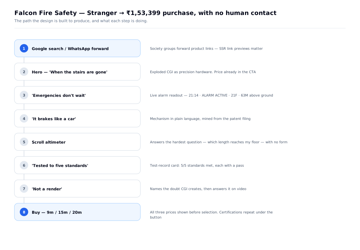
How they arrive: Google search, and — the channel that shaped the architecture — WhatsApp forwards inside residential-society groups. One resident finds it and forwards the link to 200 neighbours.
The one action: buy online. No quote, no callback, no sales visit.
The context: mid-range Android, 4G, at night, spending more than a month's salary for many buyers, with no salesperson to reassure them.
Why the channel decided the architecture. A link forwarded into a WhatsApp group renders a preview card. If that card is blank, the forward dies — and the forward is the acquisition channel. That single fact made server-rendered HTML non-negotiable and ruled out a client-only SPA before any framework discussion happened.
The problem
- A one-year-old company with no track record asking for a major one-off purchase — the kind of sum a household weighs for weeks
- For a device that holds a person's body weight over a 20–60m drop
- Bought entirely online, with no human contact before payment
- With no founder page, no test footage, no workshop video, no testimonials — none of it existed
- Against a competitor already selling a similar EN 341-certified device in India
The design problem was not aesthetics. It was trust.
What I had to work with
- CGI renders, one exploded-view animation, one phone video of the physical unit
- A patent filing — the only authoritative technical document in existence
- No photography, no testimonials, no budget to commission either
- A wrong brief (see decision 01)
- An audience on mid-range Android and 4G
Research & definition
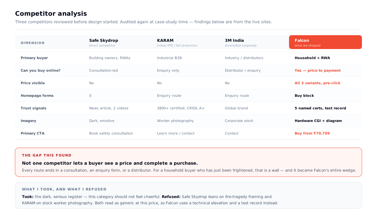
I reviewed three competitors before designing: Safe Skydrop (the only direct competitor — a comparable EN 341-certified descent device sold in India), KARAM (Indian PPE and fall-protection manufacturer), and 3M India (diversified corporate).
The finding that set the strategy: not one of them lets a buyer see a price and complete a purchase. Every route ends in a consultation, an enquiry form, or a distributor. Safe Skydrop's primary CTA is "Book safety consultation" and its homepage carries zero forms; KARAM and 3M are enquiry-only B2B.
For an industrial buyer that's normal. For a frightened parent at 11pm, it's a wall — and it's the reason the whole project became "can a stranger buy this online in four minutes."
What I took from them: the dark, serious register. This category should not feel cheerful.
What I refused: Safe Skydrop leans on fire-tragedy framing; KARAM on stock worker photography. Both read as generic at this price point, so Falcon uses a technical elevation and a test record instead.
The problem statement this produced
A first-year company with no track record must convince a stranger to make a major purchase — a device that will hold a person's body weight over a 20–60m drop — with no salesperson, no testimonials, and no photography. Design the trust, not the storefront.
Design principles, set before any screen
- Never claim what can't be checked. Every number must trace to a document.
- Anything measured is set in mono; anything said is set in sans.
- Red is a signal, not a mood — capped at ~5% of any screen.
- No fact may exist only inside an animation state.
- The client must be able to change a price on day 31 without calling me.
Problems → decisions
| # | The problem | What I decided | Why | What it changed |
|---|---|---|---|---|
| 01 | Brief assumed engineer site-visits and installs | Questioned the business model before designing | The product ships in a box; no engineer visit exists | Removed ~⅓ of scope before it was built |
| 02 | "Build trust" isn't actionable | Ranked 8 trust levers and mapped each to a location | Forces prioritisation instead of scattering proof | Certifications appear twice — once as a section, once under the Buy button |
| 03 | No photography, no video, no budget | Built the emotional beat from type + diagram | Stock fire imagery reads as filler and is corrosive at this price | A live alarm readout instead of a photograph |
| 04 | "Which length do I need?" blocks every purchase | A scroll-driven altimeter that is also the configurator | One mechanism serving narrative and conversion | No form, no phone call, no lookup table |
| 05 | Client wanted cinematic motion; performance risk was real | Measured it instead of arguing | Nobody had tested frame-sequence vs. video | 160KB mobile motion layer, now CI-enforced |
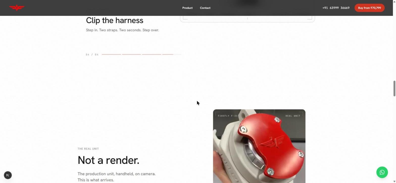
| 06 | CGI invites "does this thing exist?" | Named the doubt: "Not a render." | Answering an unspoken objection is cheaper than designing around it | Real handheld unit on video, labelled REAL UNIT |
| 07 | Client is non-technical and alone after handover | Every admin screen tested against "day 31" | Software outlives its launch | More engineering effort went into the admin than the storefront |
Decision 01 — I rejected the brief before starting
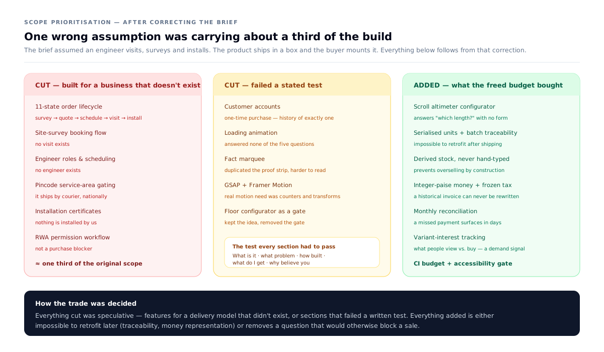
The original scope assumed a field-services business: engineer visits, surveys, configures, installs, certifies. That implied an 11-state order lifecycle, a floor-based configurator gating purchase, engineer roles, pincode service-area logic, installation certificates.
I questioned the product mechanics directly and found the assumption was wrong: Firefly ships in a box and the customer mounts it themselves. No survey. No visit. No engineer.
Impact: removed roughly a third of the scope, and replaced it with the correct flow — select length → see price → pay → ships.
The freed budget is the point. Everything cut was speculative — features for a delivery model that didn't exist, or sections that failed a written test. Everything it paid for is either impossible to retrofit later (serial traceability, integer-paise money) or removes a question that would otherwise block a sale (the length configurator).
The failure mode this avoided is the classic one: discovering the model is wrong in week three and retrofitting at ten times the cost.
Decision 02 — I ranked trust instead of "making it feel trustworthy"
| Rank | Lever | Where it shipped |
|---|---|---|
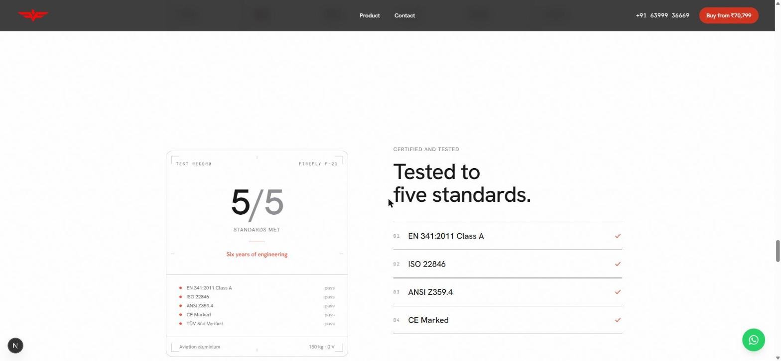
| 1 | Five certifications (EN 341:2011 Class A, ISO 22846, ANSI Z359.4, CE, TÜV Süd) | Section and under the Buy button |
| 2 | Hard numbers — 150kg rated, 30–125kg range, 0V, six years engineering | Test-record card, spec line |
| 3 | The mechanism in plain language | "It brakes like a car" |
| 4 | Product as precision hardware | Hero exploded view |
| 5 | The real unit on video | "Not a render." |
| 6 | Full legal identity — entity, registered address, grievance officer | Footer and a Grievance page, every page — built and wired to the admin; the client supplies the details |
| 7 | Visible phone number | Header |
| 8 | Plain returns policy | Checkout, footer |
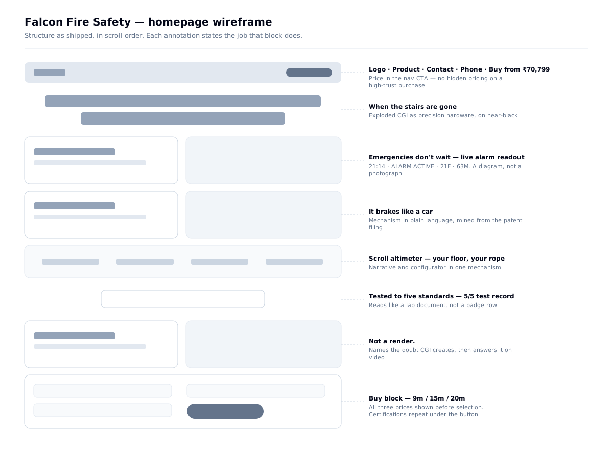
The certifications aren't a badge row — they're a test record. TEST RECORD / FIREFLY F-21, a 5/5 STANDARDS MET readout, each standard listed with a pass, material and rating in the card footer. It reads like a document from a lab, because that's the register the claim needs.
What I rejected, and why
- Invented badges — "100% Safe" is unverifiable and destroys the trust it borrows
- Stock fire photography — the competitor uses fire-tragedy imagery; it reads as generic and is corrosive at this price
- An unverifiable stat — an early prototype had "12,847 lives protected." Nothing in the source material supported it, so I deleted it. Silence beats a number you can't source. (It didn't stay deleted — see below.)
- Fake urgency — "only 3 left" on a life-safety purchase is indefensible
- Any warranty claim — the source documentation contained none. Rather than an awkward disclaimer that draws attention to the gap at checkout, the site never raises it; the absence lives only on the Refund page, where a buyer looks deliberately
What I learned: for an unproven brand selling a high-stakes product, knowing what not to say is as load-bearing as what you say.
And then it came back
The live site now has a section called "Trusted where trust is not optional." It shows 12,847 lives protected, 4,200+ buildings equipped, 386 successful deployments and a 99% success rate, above testimonials attributed to buyers in Rotterdam, São Paulo and Frankfurt. None of those figures or quotes trace to a document I was given, and the stat is the same one I removed.
The section went in after handover. The whole point of this build was a client who can change their own site without calling me — and that's also the limit of what I control. I can make sure every number on the site is sourced for as long as I'm in the room. After that, the owner decides.
What I'd do differently: I removed the stat, but I didn't write down why anywhere the owner would see it. The reasoning left with me. A one-page content rulebook handed over with the admin — every number needs a source; here is what a buyer checks first — would have made the argument for me after I'd gone. A design decision that the next editor can't see is a design decision that only lasts until handover.
How might we convey a fire emergency without a single photograph of one?
Option B was built, then replaced. That's the honest part of this project: the first version of the section shipped as four words resolving on a black screen. It looked good. It just didn't work — it conveyed dread without conveying situation, and a reader who feels dread but can't locate themselves in the scene doesn't act on it.
What replaced it
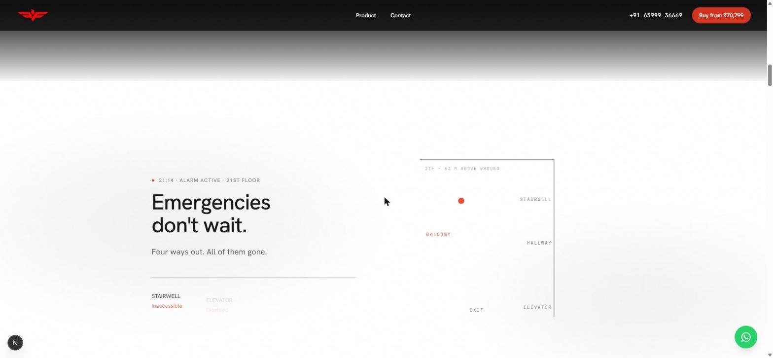
"Emergencies don't wait. Four ways out. All of them gone."
The scene is a live alarm state: a status line reading ● 21:14 · ALARM ACTIVE · 21ST FLOOR, a building elevation with the occupant marked in red at 21F · 63 M ABOVE GROUND, and the four exits at left — STAIRWELL inaccessible, ELEVATOR disabled — greying out as each fails.
Why not a photograph: it lands the stakes without one image of fire, smoke or a person in danger. And a technical elevation is a visual language this buyer already trusts — it looks like a building document, not an advert.
This section changed most during the build. The first version was literal — four words resolving on a black screen. It was atmospheric but uninformative: it conveyed dread without conveying situation. Adding the floor number, the height and the clock turned a mood into a scenario the reader could locate themselves inside. The emotional beat got stronger by becoming more factual.
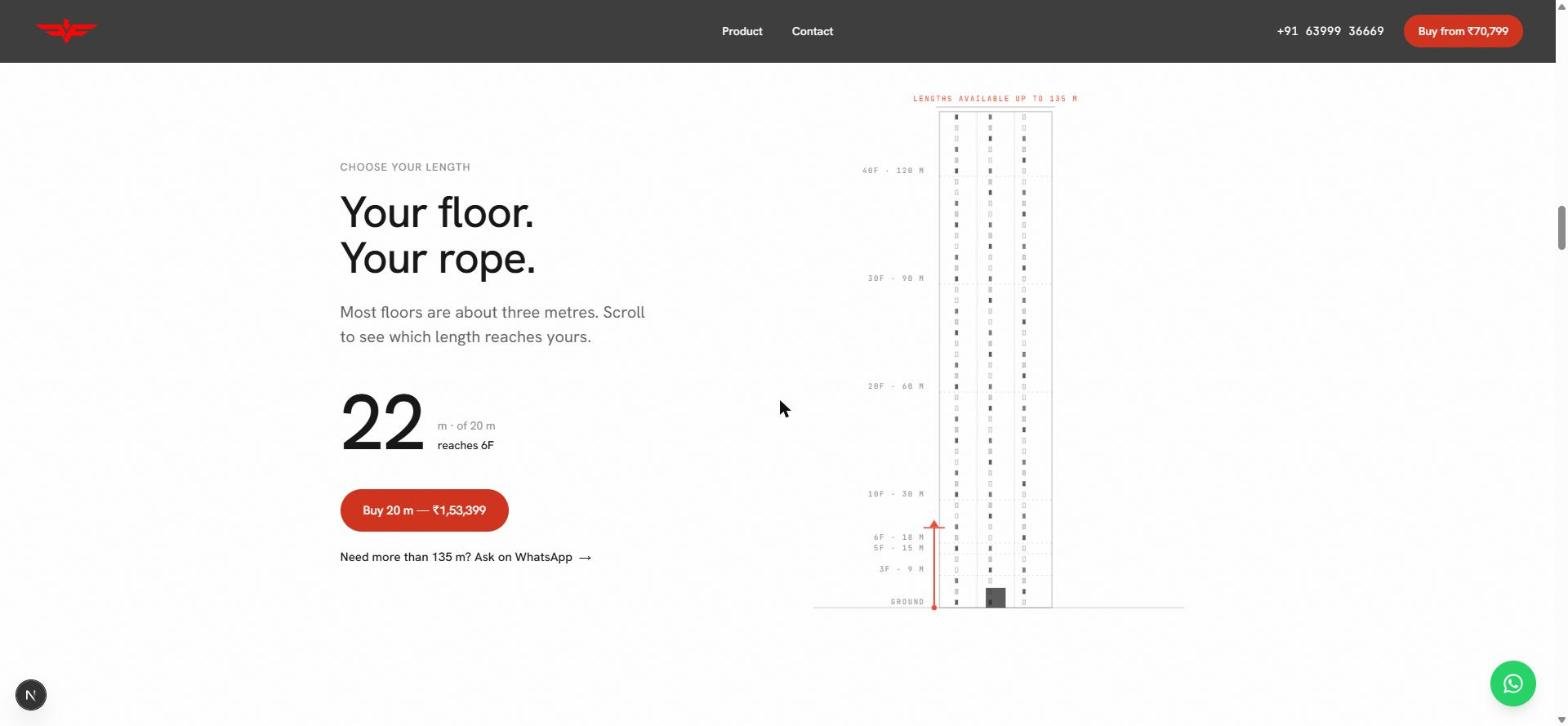
Decision 03 — The scroll that answers the hardest question
"Your floor. Your rope." — Most floors are about three metres. Scroll to see which length reaches yours.
A live metre readout climbs (22 m · of 20 m — reaches 6F) against a building elevation marked 40F · 120 M down to GROUND, and the buy button updates with it — length and price both changing as you scroll. (Lengths and prices shown are sample configuration; the client sets them from the admin.)
It does two jobs — the narrative "you are measuring your own descent" moment, and the commercial one: it answers which length do I need with no form and no phone call. One interaction pattern, two purposes, one mechanism built instead of two.
The escape hatch: under the button, "Need more than 135 m? Ask on WhatsApp →". The configurator handles the common case; the edge case gets a human, in the channel this audience already uses. Not every problem needs a UI.
Decision 04 — I ended a stakeholder argument with a measurement
The conflict: the technical side argued against heavy motion, citing mid-range Android and 4G. The client wanted a cinematic, motion-led site. Two incompatible visions, both reasonable.
Instead of picking a side by opinion, I converted the disputed asset — a 13.6-second CGI rotation — into a scroll-scrubbed frame sequence and measured it:
| Tier | Frames | Weight |
|---|---|---|
| Desktop | 97 @ 1440px | 1.19 MB |
| Mobile | 36 @ 720px | 0.16 MB |
The entire mobile hero motion sequence is 160KB — lighter than one unoptimised hero photograph.
The untested variable was never motion vs. no motion. It was frame sequence vs. video.
And the budget became a build gate, not an opinion:
// scripts/check-bundle-budget.mjs
const BUDGET_BYTES_GZIPPED = 250 * 1024;   // fails the build if breached
// lighthouserc.json
"categories:performance":   ["error", { "minScore": 0.85 }],
"categories:accessibility": ["error", { "minScore": 0.95 }]
What I learned: turning a subjective design argument into a falsifiable number is faster than winning it by authority — and it leaves behind a guardrail instead of an opinion.
Decision 05 — Copy as a system
Every section had to answer one of five questions or be cut, not trimmed:
What is it · What problem does it solve · How is it built · What do I get · Why should I believe you
Real cuts followed: the loading animation (answered nothing, delayed first paint) and a marquee (repeated the proof strip in a harder-to-read format).
Hard limits: headlines ≤ 6 words · body ≤ 40 words per section · specs as labelled lines, never sentences · homepage readable in 60 seconds.
The rule holds in the shipped copy — "When the stairs are gone." · "Emergencies don't wait." · "Your floor. Your rope." · "Tested to five standards." · "Not a render." Five words or fewer, every one.
Where the copy came from: I mined the patent filing — the only authoritative document available — for language that was already precise:
"a friction-based braking mechanism, similar to brake pads… to maintain a stable and safe descent speed regardless of user weight."
That became "It brakes like a car."
I excluded two lines from the same document — "the fastest way to escape a building" and "this concept does not exist in the safety industry yet" — because both were checkably false. A competitor already sells a similar certified device in India, and claiming category novelty would be caught by exactly the informed buyer the product needs.
The design system
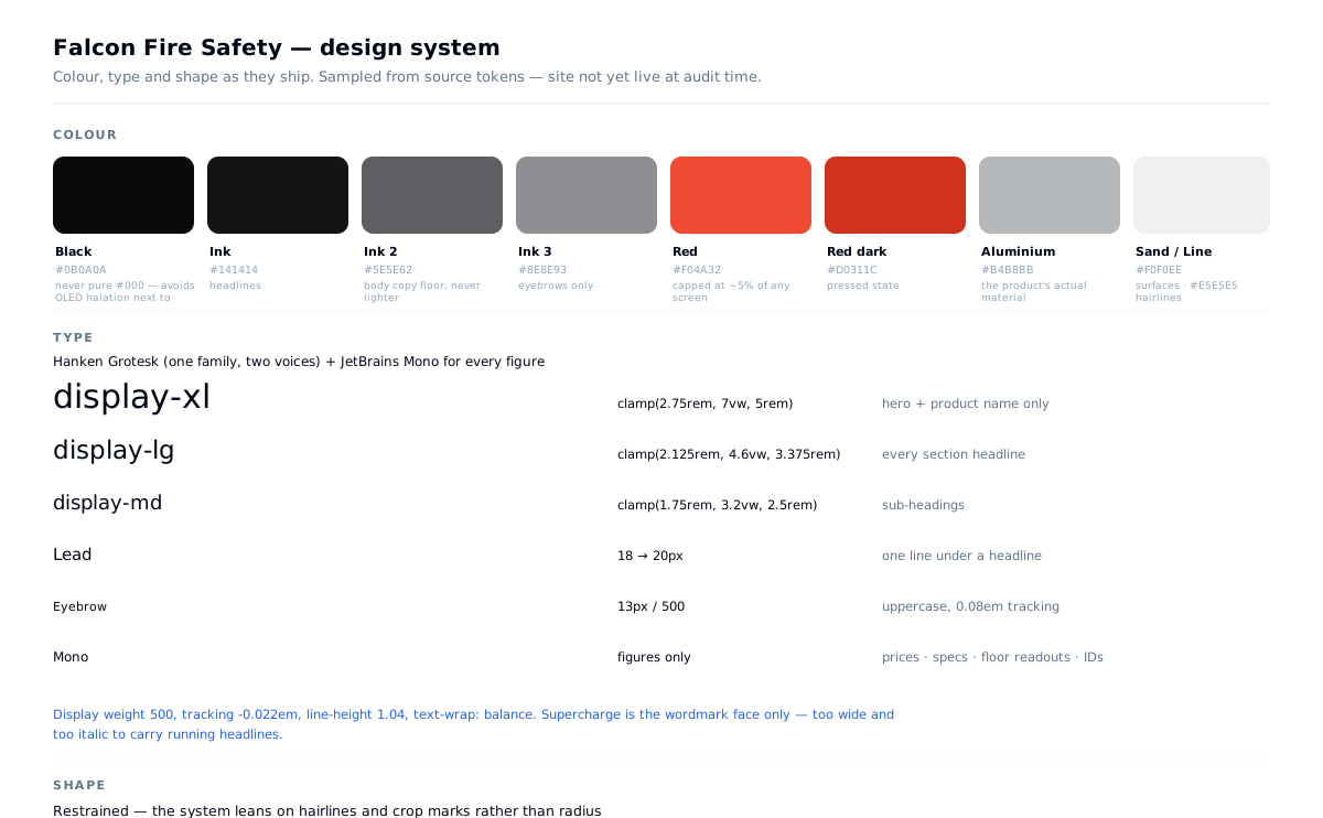
Tokens are generated from one file — packages/shared/src/tokens.ts — and consumed by both storefront and admin, so the two cannot drift.
Colour. Red/black/white was both the correct palette — it's the product's own packaging — and the most clichéd palette in fire safety. I kept it and disciplined the execution: red is capped at roughly 5% of any screen. Sampling the shipped pages confirms it holds — red never enters the top eight colours by area. The fourth neutral isn't invented: #B4B8BB is the aluminium the device is made from.
Body copy has a hard floor at --ink-2 — never lighter — because a meaningful share of buyers are committee members over 50 reading on a phone at night. A Lighthouse accessibility gate at 0.95 runs in CI on every build, alongside the 250KB JS budget.
What the gate does and doesn't cover. Lighthouse's accessibility score is a weighted subset of the axe ruleset, so a build can clear the composite threshold while individual contrast pairs still fail — particularly the small mono label tier on dark grounds, which is where a dark-first palette is always most fragile. The gate catches regressions in structure and labelling; it is not a substitute for checking contrast pair by pair, which is a separate step.
A dark-to-light arc, sharper than planned. The hero is near-black (#0E0E0E measured, 13.8% of the frame); every section after it is white. The plan was a gradual gradient; in build it became one hard transition. Narrative opens in the dark; everything transactional lives in the light, because that's where tables, prices and forms read best.
Typography — a decision I corrected mid-build. The plan was to use Supercharge, the brand's expanded italic, for all large headlines. In build it couldn't carry running headlines at any size. I restricted it to the wordmark only:
/* Supercharge is the brand's wordmark face and appears only there;
   it is too wide and too italic to carry running headlines. */
What shipped is one family in two voices, plus JetBrains Mono used strictly for figures. That split is the system's load-bearing idea: anything measured is set in mono; anything said is set in sans. It's why a spec line reads as instrumentation rather than marketing.
A technical-drawing motif. Corner crop marks bracket the hero, the product viewer and the test-record card. Section labels are mono, uppercase, widely tracked. The page borrows the grammar of an engineering document — the one register this buyer already trusts.
Motion. Every animation reads correctly with JS disabled and under prefers-reduced-motion. No spec, price or fact exists only inside an animation state.
The interface
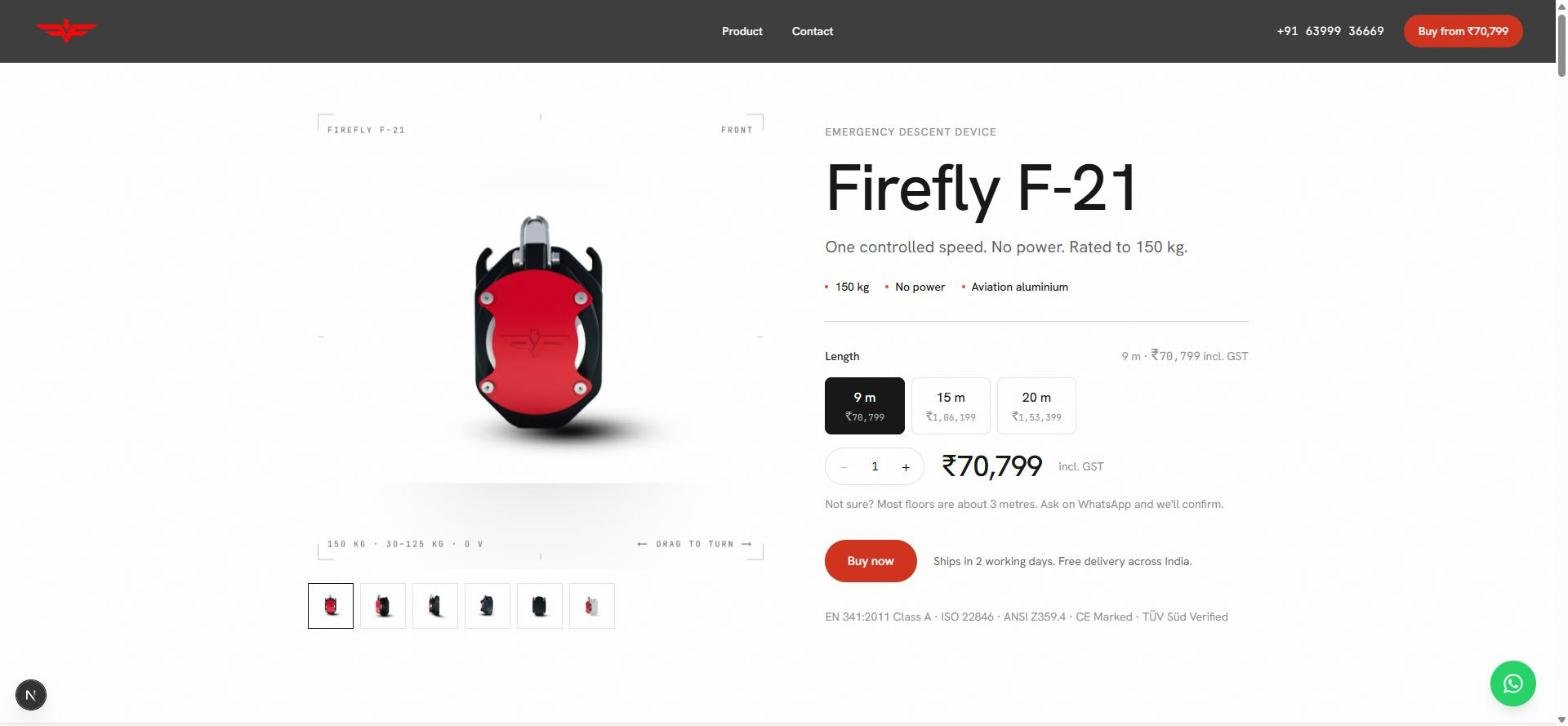
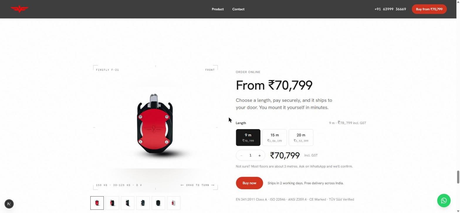
One rule: a buyer should never scroll to decide. Above the fold — the name, the one-line claim, three proof chips, three length variants with prices, quantity, live total incl. GST, the WhatsApp fallback, the Buy button, shipping terms, and the five certifications.
- Every length's price shows on its variant button, unselected. One price that changes on click makes the buyer work to compare — on a purchase this size, hiding the comparison reads as a tactic. (Prices in the screenshots are sample configuration; the client sets real pricing from the admin.)
- "Ships in 3 working days. Free delivery across India." sits beside the button, not in a shipping tab. The two unanswered questions at payment are when and how much extra.
- The gallery is drag-to-turn across six angles, because for a device you mount yourself, what does the back look like is a real question.
The half nobody looks at first
The admin took the larger share of the work — more than double the storefront. Its user isn't an anonymous visitor; it's one non-technical owner running the business alone, for years, after I'm gone.
The test every screen was designed against: on day 31, can the client change a price, a phone number, or a length variant without calling a developer?
What's built: Dashboard · Orders · Customers · Enquiries & Tickets · Product (pricing, serialised units, batches, variant interest) · Shipments · Finances (reconciliation, monthly reconciliation) · Marketing (discounts, popups, announcement bar) · Content · Settings (general, email, payments, shipping, tax, legal metrology, SEO, notifications, users).
Enquiries and Tickets are deliberately two funnels, not one inbox — a pre-sale question and a post-sale device fault need different urgency.
Four decisions inside it
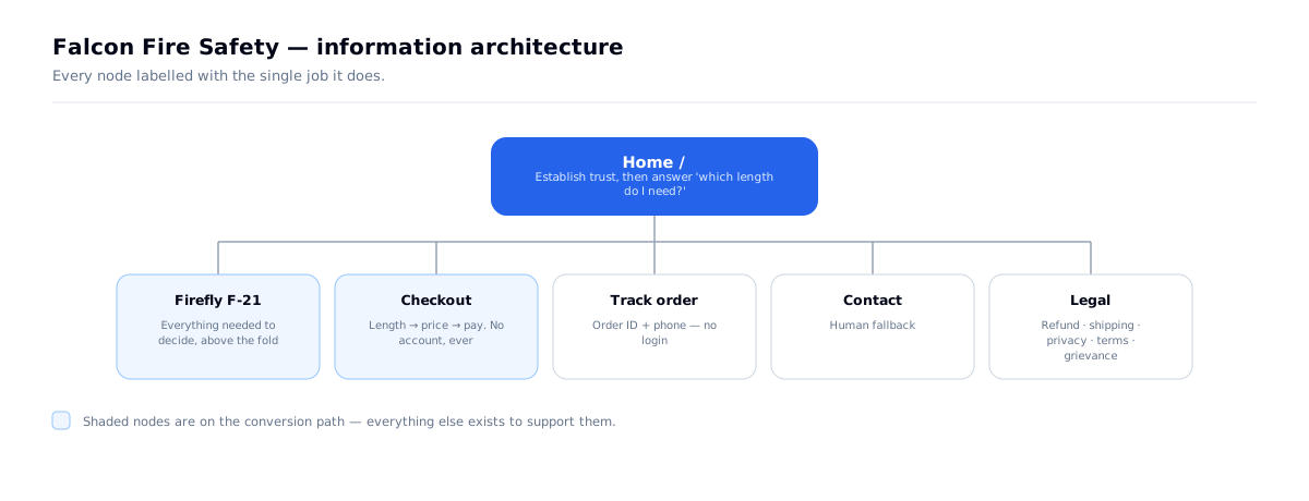
No customer accounts, anywhere. One-time purchase — an account would show an order history of exactly one. Removing it removed password resets, session management and the entire account UI, and left one credential type in the whole system. Customers track orders by order ID + phone.
Stock is derived, never typed. Availability is computed from unallocated serialised units. Two independently-maintained numbers for the same fact always drift — this prevents overselling by construction, not by discipline.
Serial and batch traceability from day one, before the recall UI existed. Retrofitting traceability onto units that have already shipped means reconstructing history from paper.
Money in integer paise, server-side only. Tax is computed once and frozen onto the order at sale, so a later price or tax change can never rewrite a historical invoice. The pricing module has its own tests, including a rounding-boundary case where ₹333.33 at 18% doesn't divide evenly.
What I learned: the storefront optimises for a four-second first impression. The admin optimises for can this person run their business correctly at 11pm, six months from now, without me. Different discipline, same project.
Performance — measured on the live site
The motion argument in Decision 04 was settled with a number before build. This is the number after: Lighthouse 13.5 against the live homepage, falconfiresafety.in.
| Mobile | Desktop | |
|---|---|---|
| Performance | 90 | 97 |
| Accessibility | 97 | 95 |
| Best practices | 100 | 100 |
| SEO | 100 | 100 |
| First Contentful Paint | 1.3 s | 0.3 s |
| Largest Contentful Paint | 2.8 s | 0.6 s |
| Total Blocking Time | 240 ms | 0 ms |
| Cumulative Layout Shift | 0 | 0 |
| Page weight | 591 KB | 1.2 MB |
Mobile uses Lighthouse's default simulated mid-range phone on a throttled 4G connection — the exact device this buyer was designed for.
What the numbers confirm. A homepage carrying a scroll-scrubbed hero, a scroll-driven altimeter and a drag-to-turn product viewer loads its largest element in 0.6 seconds on desktop and 2.8 on a throttled phone — inside Google's 2.5–4s "needs improvement" band on mobile and well inside "good" everywhere else. Layout shift is zero on both, which matters more than it sounds on a page this animated: nothing moves under a thumb reaching for Buy. The whole mobile page, motion included, is 591 KB. Both CI gates hold on the live build — performance ≥ 0.85, accessibility ≥ 0.95.
What they don't hide. The accessibility audit fails one rule, and it's the one I predicted in the design-system section. --ink-3 (#8E8E93) sits at 3.26:1 on white where it's used for 13–14px eyebrows and captions, and the signal red #F04A32 sits at 3.66:1 on the 12px mono figures — both under the 4.5:1 AA floor for text that size. The composite score clears 0.95 anyway, which is exactly why the gate was never meant to be the only check. The fix is small: move the small-text tier to --ink-2 (#5E5E62, 6.4:1) and keep red for fills and large figures.
The other cost left is the server, not the page: the HTML document takes 1.4–2.1 seconds to arrive before the browser can start. Everything after that first byte is fast; the first byte is the next thing to fix.
The usability protocol
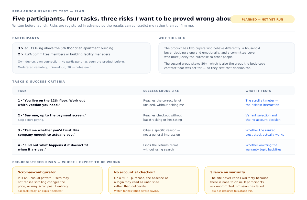
Lighthouse measures the machine. The usability protocol measures the buyer, and it was written before anyone saw the site so the results can contradict me rather than confirm me. Three things I expect to be wrong about, and each task is designed to surface one:
- Scroll-as-configurator is an unusual pattern. Users may not realise scrolling changes the price, or may scroll past it entirely. An explicit selector is ready as a fallback.
- No account at checkout may read as unfinished rather than deliberate on a purchase this size. Task 2 stops at the payment screen specifically to watch for hesitation.
- Silence on warranty may backfire. The site never raises it because there's nothing to claim — but if participants ask unprompted, then staying silent has failed and the Refund page isn't doing enough.
Participants are three household buyers above the fifth floor and two RWA committee members — the second group skews 50+, which is also the group the body-copy contrast floor was set for, so they test that decision at the same time.
Why write the hypotheses down first: because registering what I expect to fail, before running it, is the difference between testing and looking for confirmation.
Tech decisions, and why
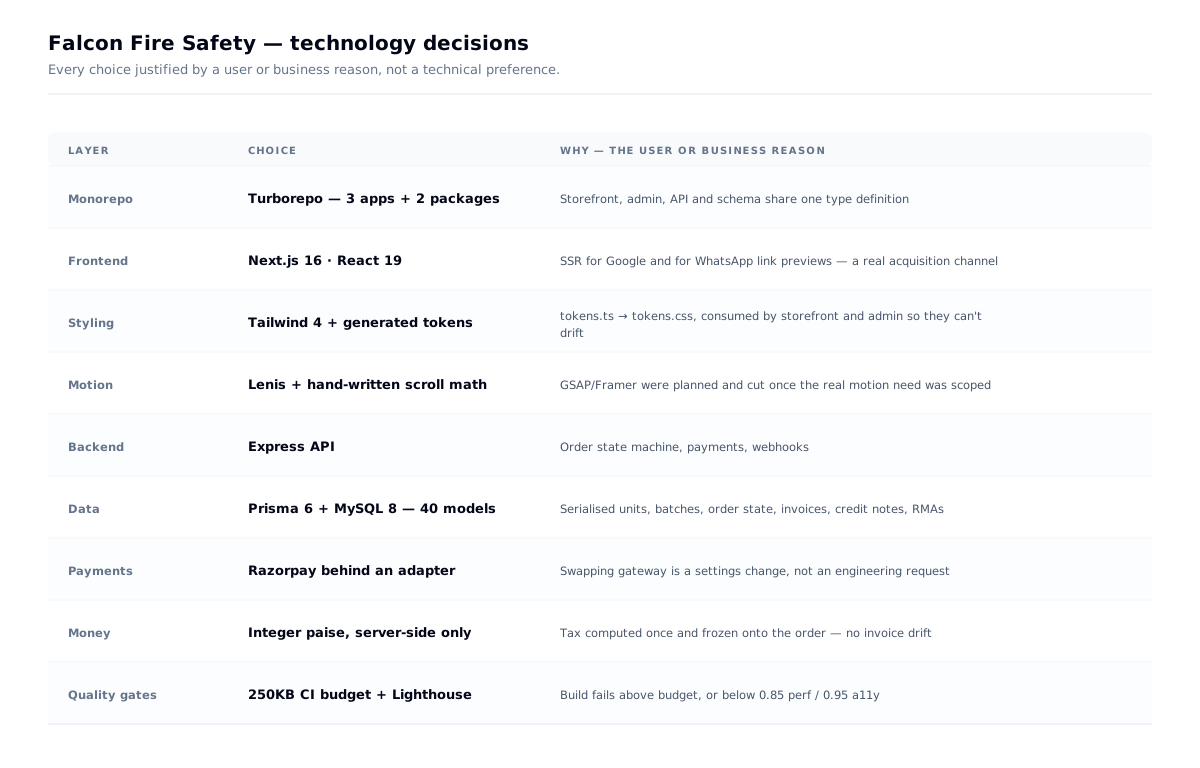
The one worth calling out: Next.js over an SPA, because of WhatsApp. Buyers forward product links inside residential-society groups, and a client-only React app renders a blank preview card. The acquisition channel dictated the rendering strategy — not the other way round.
And the one I cut: GSAP and Framer Motion were both in the original plan. Once the real motion inventory was scoped — scroll-linked counters, CSS transforms, a canvas frame player — a full animation library was weight the project didn't need. Lenis plus hand-written scroll math covered every case.
Outcome
- A three-app system — storefront, admin, API — built solo in under a month, live at falconfiresafety.in
- Roughly a third of the original scope removed by catching the wrong business model before design started
- 160KB mobile motion layer, with a 250KB CI-enforced JS budget and Lighthouse gates at 0.85 / 0.95
- On the live site: Lighthouse performance 97 desktop / 90 mobile, 0.6s desktop LCP, 0 layout shift, and 100 for both SEO and best practices
- 40-model data schema with serialised inventory, order state machine, invoices and reconciliation
- A client who can run pricing, inventory, content, tax and SEO without a developer
What I learned
Leaving things out is a design skill — and it has to survive handover. The unverifiable stat I deleted did more good gone than present. It came back after I left, because the reason for removing it left with me. Hand over the rules along with the admin.
Constraints beat resources. Having no photography is why this site doesn't look like every other fire-safety site.
Measure the disagreement. "Motion vs. no motion" was the wrong argument entirely.
Facts can be more emotional than atmosphere. The dread section got stronger when I added the floor number and the clock.
One system, two users. The visitor and the owner want opposite things. Designing only for the visible one is how software becomes unmaintainable the month after handover.