Digi Pexel
Selling AI automation to people who have already been pitched it six times this month.
- Role
- End-to-end UX/UI & Development
- Timeline
- 6 weeks
- Status
- Live at digipexel.com
- Platform
- Marketing site + CMS
- Industry
- AI services
Project overview
- What it is
- Redesign + replatform — WordPress → custom build. Marketing site, lead capture, CMS
- The company
- Digi Pexel — an AI automation agency building workflow automation for operations teams
- Industry
- AI services / automation consulting
- My role
- Sole designer & developer — research, IA, design system, UI, copy, frontend, backend, admin
- Team
- Solo
- Stack
- Next.js (static export) · React · TypeScript · Tailwind · PHP API · MySQL · Tiptap · Zod
- Status
- Live at digipexel.com
Who it's for, and how they arrive
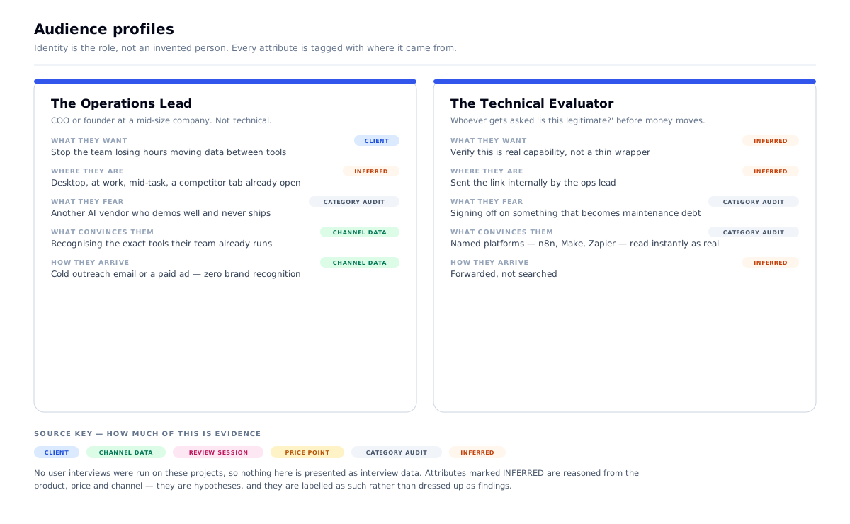
Primary user: an operations lead, COO or founder at a mid-size company who knows their team wastes time moving data between tools, and suspects AI could fix it — but has no way to tell a real vendor from a wrapper.
Secondary user: a technical evaluator who will be asked "is this legitimate?" and will check the integrations.
How they arrive: cold outreach and paid ads. Almost nobody arrives searching for "Digi Pexel." That single fact governs the whole design.
The one action: Book a strategy call. No purchase, no signup, no download. One conversion event.
The context: a cold visitor, arriving suspicious, on desktop, with a competitor's tab already open. They will give the page a few seconds to prove it isn't hype.
Why the channel matters here more than on any other project in this portfolio. A search visitor has already decided they have the problem — they're choosing a vendor. A cold-outreach visitor hasn't agreed they have a problem at all, and their default assumption is that this is another AI grifter. So the page has to do two jobs a search-traffic page never does: establish the problem exists, then prove the company is real — before it is allowed to sell anything.
The problem
- The category is saturated with hype. "AI automation agency" carries an active credibility penalty in 2026
- The traffic is cold — zero brand recognition, zero prior trust, high bounce intent
- The service is abstract. "Workflow automation" is invisible; there's no product to photograph
- The buyer can't evaluate the work — they can't read an n8n workflow and judge it
- Competitors all claim the same things with the same words
What I had to work with
- No product screenshots — the deliverable is a workflow running inside someone else's private stack
- No case studies and no client logos at launch — the company was young
- Seven Trustpilot reviews, total
- Shared hosting with no Node runtime — a real infrastructure constraint that shaped the architecture
- One conversion goal and a cold audience
- An existing site to replace — this was a redesign
What was already there
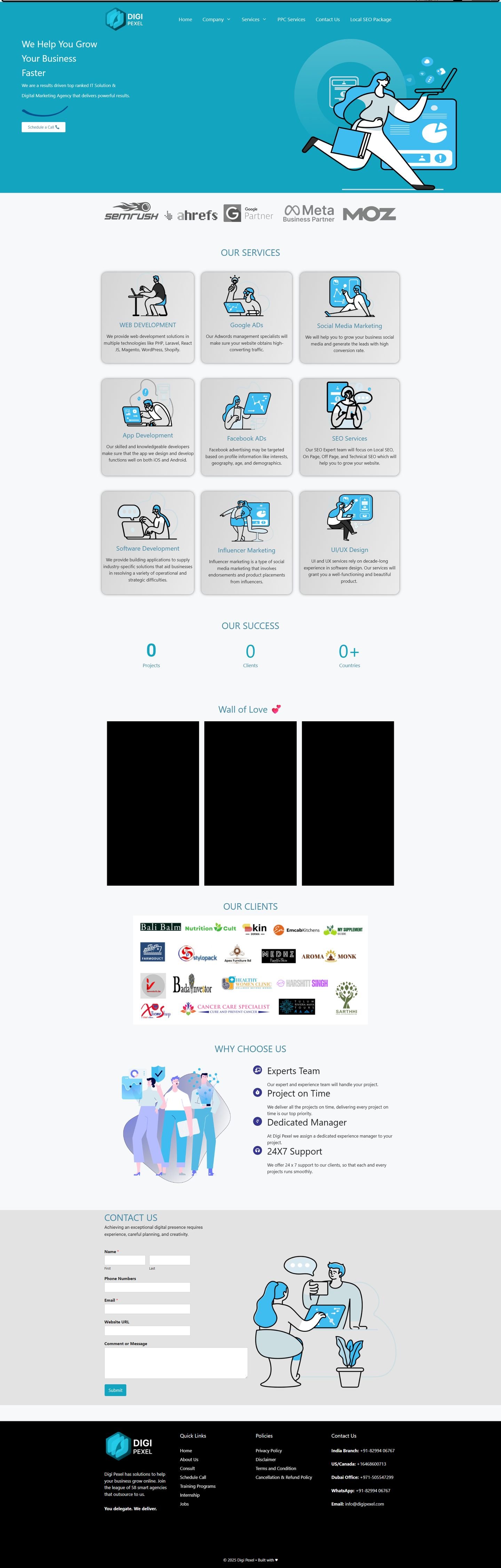
Captured from the Internet Archive, February 2025.
The previous site was a WordPress page-builder template. The problem wasn't that it was ugly — it was that its trust signals were broken, and broken trust signals are worse than none.
The counters read 0 Projects · 0 Clients · 0+ Countries. Animated stat counters that had never been configured, sitting in the middle of the homepage of an agency asking you to hand over your operations.
The "Wall of Love" testimonial section was three empty black boxes. Video embeds that didn't load.
A cold visitor arriving from an outreach email — already suspicious, already assuming this is another AI grifter — reads zeros and empty frames and gets their suspicion confirmed in about two seconds. That is worse than having no social proof section at all, and it's the single clearest argument for the principle the redesign was built on: every proof point must be checkable, or it doesn't ship.
The rest followed: cartoon stock illustration throughout (generic, and identical to a hundred other agency sites), a five-field contact form as the only conversion path, and a builder-platform footer.
What the redesign kept: nothing visual. What it kept from the analysis: the observation that this audience needs proof before it needs persuasion — which is why the new build leads with named platform logos and a real, checkable review count instead of counters that depend on configuration and can render as zero.
Research & definition
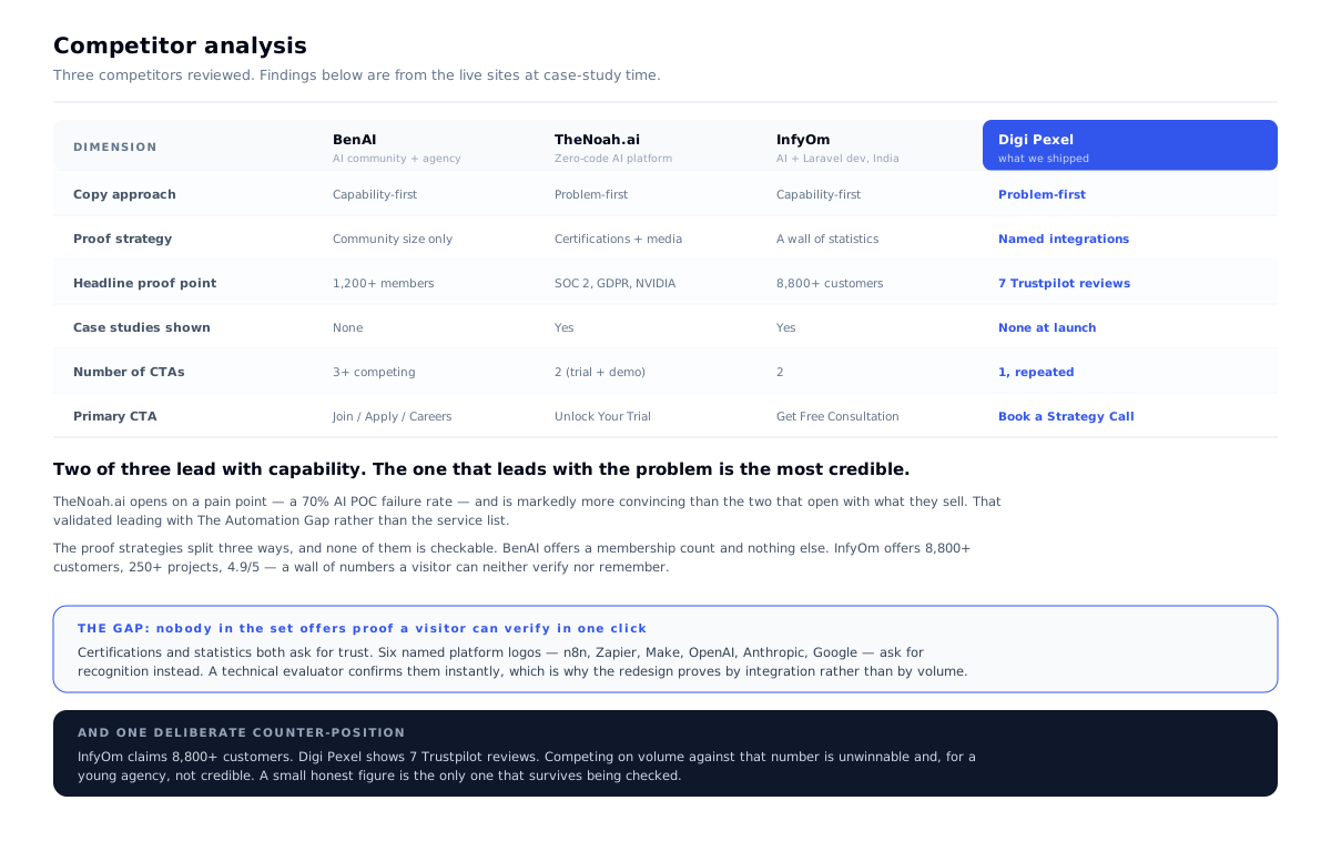
I reviewed three competitors before designing: BenAI, TheNoah.ai and InfyOm — the range of who a cold visitor might already have seen.
The finding that set the structure: two of the three lead with capability, and the one that leads with the problem — TheNoah.ai, opening on a 70% AI POC failure rate — is markedly more convincing. That's why the redesign opens with The Automation Gap rather than a service list.
The finding that set the proof strategy: none of the three offers proof a visitor can verify. BenAI gives a membership count and no case studies. InfyOm gives 8,800+ customers, 250+ projects, 4.9/5 — a wall of numbers you can neither check nor remember. Certifications and statistics both ask for trust; named platform logos ask for recognition instead, and a technical evaluator confirms them in a second.
It also settled the CTA count. BenAI runs three competing calls to action — join, apply, careers — with no clear priority. On cold traffic that splits an already-thin intent, so this site ships one ask, repeated.
The problem statement this produced
A cold visitor in a category with an active credibility penalty will not accept a claim they cannot check. Prove the problem exists, then prove the company is real — using evidence the visitor can verify without leaving the page.
Problems → decisions
| # | The problem | What I decided | Why | What it changed |
|---|---|---|---|---|
| 01 | Cold visitors don't agree they have a problem | Open by quantifying the problem, not the service | You can't sell a fix to someone who hasn't accepted the fault | "The Automation Gap" section became the argument's foundation |
| 02 | Abstract service, nothing to show | Prove by integration, not illustration | Named tools the buyer already uses are checkable; stock AI art is not | Google, OpenAI, Anthropic, n8n, Zapier, Make surround the headline |
| 03 | Only 7 Trustpilot reviews — too few to boast | Show the number anyway | "See our 7 reviews" is checkable; "trusted by hundreds" is not | A weakness converted into a proof of honesty |
| 04 | One conversion goal, cold traffic | Make "Book a call" the only ask, everywhere | Competing CTAs on cold traffic split an already-thin intent | Single CTA in nav, hero, mid-page and footer |
| 05 | Shared hosting, no Node runtime | Static export + PHP API | Pre-rendered HTML on cheap hosting: fast, indexable, nothing to keep running | Removed a whole class of hosting cost and failure |
Decision 01 — Sell the problem before the service
The hero states the promise — "Automate with AI that ships" — with the operative word being ships, a direct swipe at the category's failure mode: pilots that never reach production.
Then, immediately, three chips that pre-empt the three real objections:
Remove manual handoffs · Connect every system · Measure ROI every week
The third is the important one. "Measure ROI every week" is the answer to the buyer's actual fear — not "will it work" but "will I be able to tell whether it worked." Naming that in the hero, before any service is described, is the page's most load-bearing sentence.
Below it, "The Automation Gap" quantifies the problem in the buyer's own operational terms: 14 hours lost weekly per team · 6+ disconnected tools · 40% rework.
What I rejected: opening with the service list, which is what every competitor does. A services menu asks a cold visitor to self-diagnose. A cold visitor won't — they'll leave. Diagnose first, prescribe second.
What I learned: on cold traffic, the first job is not persuasion, it's recognition. The visitor has to see their own week described before they'll accept that you can change it.
Design principles, set before any screen
- Establish the problem before naming the service. Cold traffic hasn't agreed there's a fault yet.
- Every proof point must be checkable. No claim the visitor can't verify in one click.
- One ask, everywhere. Competing CTAs split already-thin cold intent.
- Volume in the type, quiet in the colour. The credibility risk here is over-claiming.
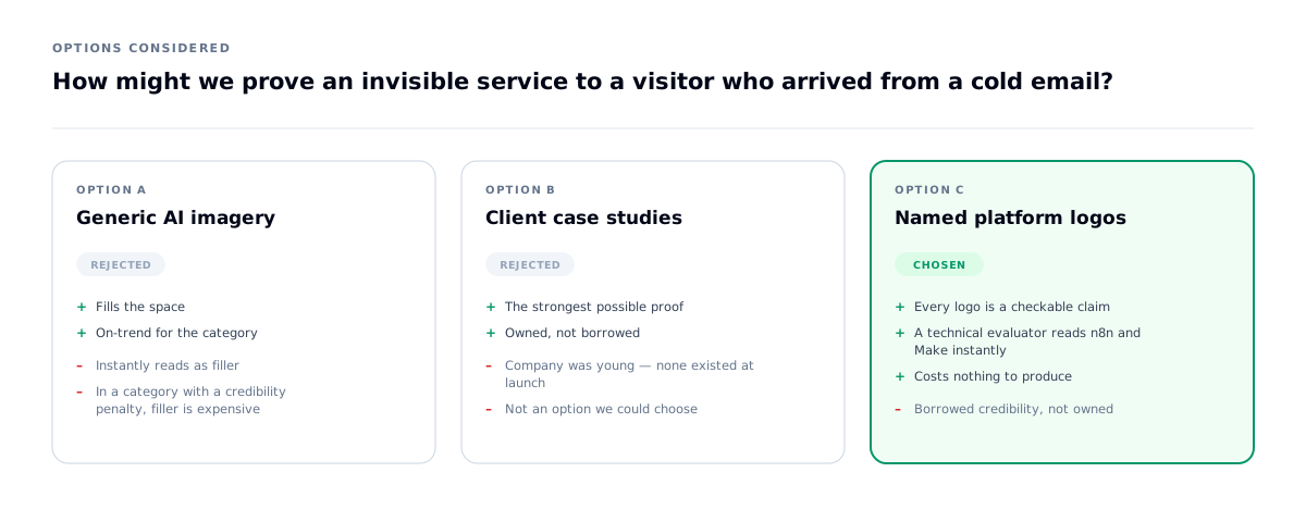
How might we prove an invisible service to a visitor who arrived from a cold email?
The hardest design problem here: the product is invisible. A workflow lives inside a client's private stack. There is nothing to screenshot.
The hero is framed by six real, named platform logos — Google, OpenAI, Anthropic, n8n, Zapier, Make — in labelled cards around the headline.
Why this works: each one is a checkable claim. A technical evaluator recognising n8n and Make learns more in one second than a paragraph could tell them — those are the tools someone doing this work actually uses. The logos aren't decoration; they're the specification.
What I learned: when you can't show the work, show the materials. Six tools a technical evaluator recognises do more than a paragraph of claims, and they cost nothing to produce because they're simply true.
Decision 02 — A deliberately loud typographic voice
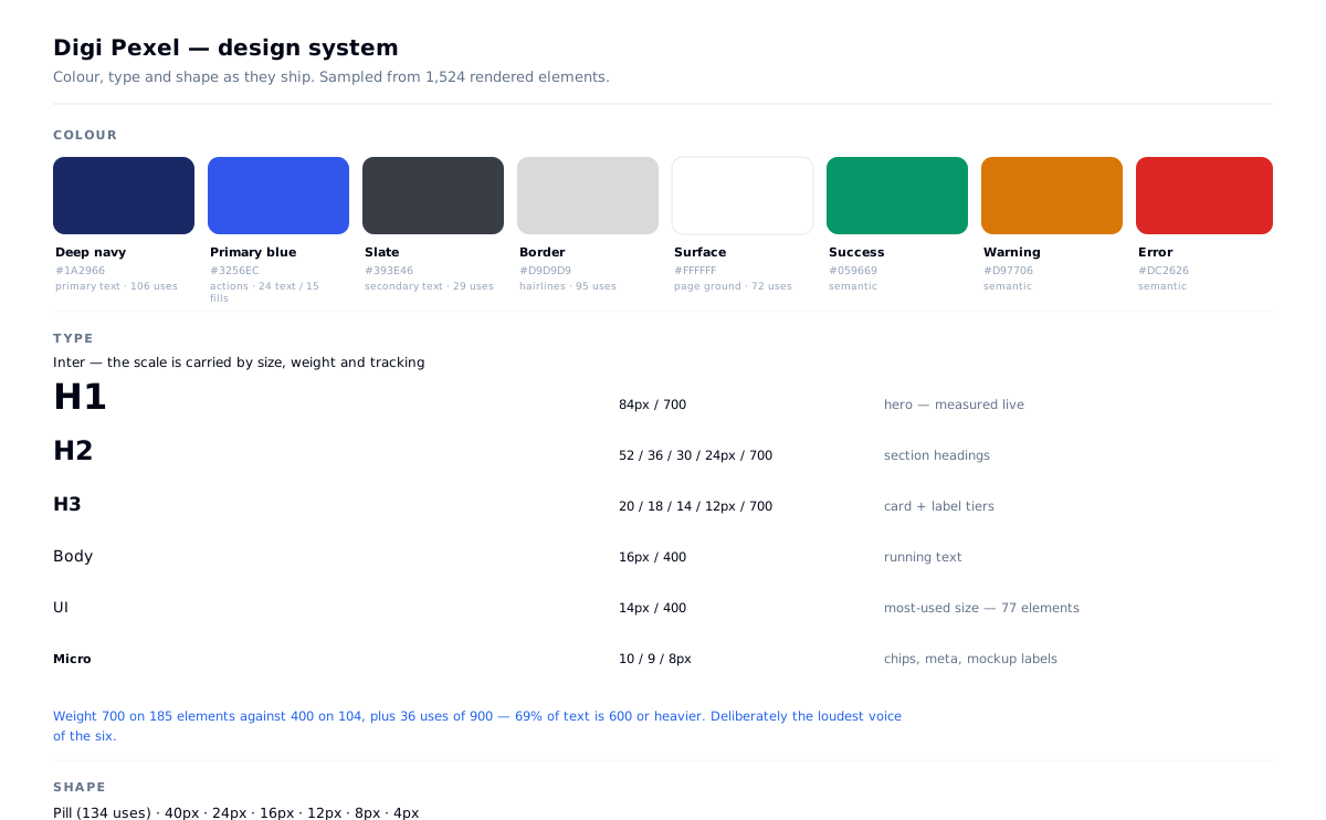
Sampled from the live DOM across 1,524 elements:
Type: Inter throughout. h1 84px/700 · h2 52 / 36 / 30 / 24px/700 · h3 20 / 18 / 14 / 12px/700. Weight 700 appears on 183 elements against 400 on 104 — bold outnumbers regular nearly 2:1, with 37 uses of weight 900. Display tracking runs tight (-0.2 to -0.9px).
Shape: pill radii on 134 elements, plus 40px, 24px, 16px, 12px.
This is the boldest and roundest of the six systems, and it's a deliberate register: confident and approachable rather than technical and austere. Falcon needed to feel like an engineering document. This needs to feel like a competent person who will not waste your time — the difference between a lab and a consultancy.
Colour is doing very little work, and that's intentional: one navy, one blue, one grey, one border. On a page whose credibility problem is over-claiming, a loud palette would have compounded it. The volume is in the type; the colour stays quiet.
| Role | Value |
|---|---|
| Deep navy — primary text | #1A2966 (106 elements) |
| Primary blue — action | #3256EC |
| Slate — secondary | #393E46 |
| Border | #D9D9D9 (95 elements) |
| Surface | #FFFFFF |
Decision 03 — Static export + PHP, because of where it had to live
The site had to run on shared hosting with no Node runtime. That constraint could have meant WordPress. Instead:
- Next.js static export — every page pre-rendered to HTML at build time, deployed as flat files
- A small PHP API for the dynamic parts: lead capture, CMS content, admin auth
- MySQL behind it
Why it's the right call rather than a compromise: the site is 95% static content. Pre-rendered HTML on shared hosting is faster than a server-rendered app, has no runtime to crash, no Node process to keep alive, no scaling cost, and is trivially indexable — which matters because paid traffic and organic both land on the same pages.
The 5% that genuinely needs a server — a form submission, an admin login — is the only part that touches PHP.
What I rejected: a full Node deployment, which would have meant a VPS, a process manager, and a monthly cost with no user-facing benefit; and WordPress, which would have meant fighting a theme system to build a bespoke design.
What I learned: hosting is a design constraint. Choosing the architecture that fits where the site actually lives is a more useful decision than choosing the one that sounds most current.
The interface
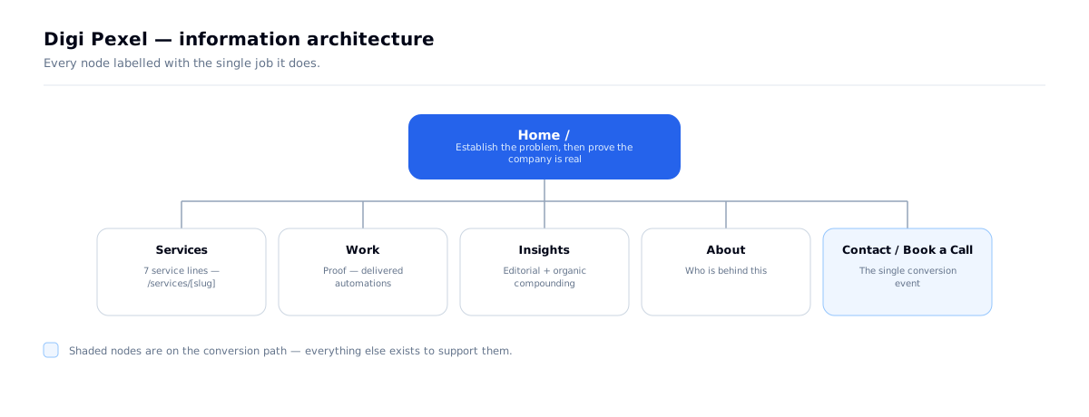
Six top-level pages, one of which is the conversion event. Everything else exists to get a sceptical visitor to it.
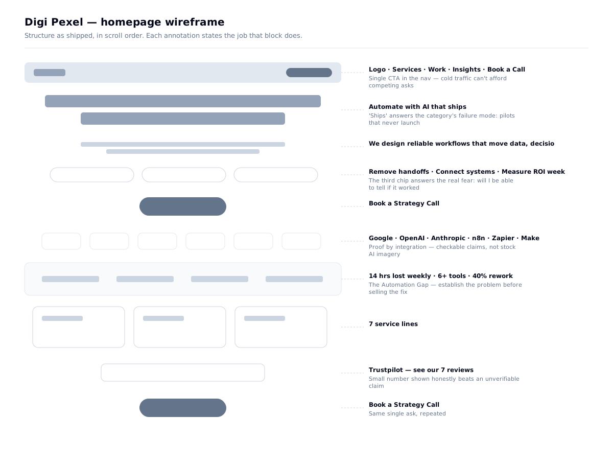
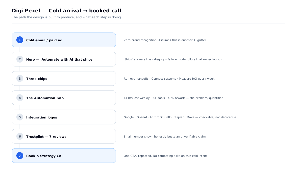
The scroll order is the argument: promise → objections pre-empted → proof by integration → the problem quantified → services → honest review count → one ask. A cold visitor is never asked to accept a claim before they've been given something they can check.
Instrumentation — choosing the right measurement for the traffic you have
A site with one conversion goal and roughly 700 monthly visits cannot be optimised the way a high-traffic site can, and pretending otherwise is the most common analytics mistake in this category.
The maths rules out A/B testing. At ~700 visits a month with a single booking action, detecting even a large improvement — say a lift from 2% to 3% — would take many months per variant to reach significance. Any test called earlier than that is reading noise. So split-testing was never a real option here, and building for it would have been wasted effort.
That makes the correct instrument qualitative, not quantitative. What I installed instead:
Why this combination is the decision, not the default. With low traffic and one goal, n of 20 watched sessions tells you more than a statistically underpowered test ever will. Recordings surface the specific moment a cold visitor stops reading — which is exactly the risk this design carries, since the whole page rests on an unproven assumption that establishing the problem before naming the service holds a sceptical reader.
Adding tag management rather than hardcoding scripts follows the same principle as the rest of the build: the client changes things without a developer. On a static-export site, where every content change needs a rebuild and redeploy, being able to add a tracking pixel from a web UI is a meaningful piece of independence.
Monitoring is ongoing, not a launch checkbox. The site is watched after handover rather than treated as finished at delivery — recordings and conversion data are reviewed, and what surfaces goes back into the build. The admin changes described in the next section came out of exactly that kind of post-launch observation.
Specific behavioural findings from the recordings aren't written up here yet. When there's enough data to name a pattern rather than an impression, it belongs in this section — the same standard applied to Falcon's test plan.
| Tool | What it answers |
|---|---|
| Microsoft Clarity (via GTM) | Session recordings and heatmaps — where individual visitors hesitate, rage-click or leave |
GA4 G-0SL7NBGZ9P | Sessions, sources, and the booking conversion |
GTM GTM-5GPTQHV | Tag management, so the client can add tracking without a redeploy |
Validation — the client's feedback was entirely about the admin
Once the client started publishing, I collected their feedback. Not one item was about the public site. Every single point was about the editor:
Why this mattered more than it looks. I had spent the project's design effort on a cold-traffic homepage — the thing I'd be judged on. The client's experience of my work was almost entirely the twenty minutes a week they spend writing a post, and in that twenty minutes the tool was fighting them.
The publish-state items are the serious ones. A CMS that leaves someone unsure whether their post is live has failed at the only thing they came to it for — and their response isn't to file a bug, it's to stop publishing. An unused CMS is a dead content strategy, which undoes the organic-search half of the acquisition plan.
What I changed: made publish state explicit rather than inferred, fixed the image validation and its error message, made link text editable, and pinned the toolbar.
What I learned: on a project with a public site and an admin, I will be reviewed on the public site and lived in through the admin. Design effort should be split by time spent, not by visibility.
The same thing happened on Buildera soon after. I clustered both clients' reports together — the affinity map is in that case study — and "anchor text is not editable" turned up independently in both. Two clients reporting the same defect without knowing about each other is the clearest signal in the set.

| What they hit | What it actually was |
|---|---|
| "Whenever I put the title, it is showing in draft" | Publish state was ambiguous — they couldn't tell what was live |
| "The blog, after publishing, is not visible on the website" | Same problem, one step later — no confirmation that publishing worked |
| "Featured image is not accepting, asking for jpg/png, but the image is already PNG" | Validation rejecting a valid file, with an error that blamed the user |
| "Anchor text in the link is not editable" | You could create a link but not fix its wording |
| "Stick the H1 bar and the image bar" | The toolbar scrolled away in long posts, so formatting meant scrolling back up |
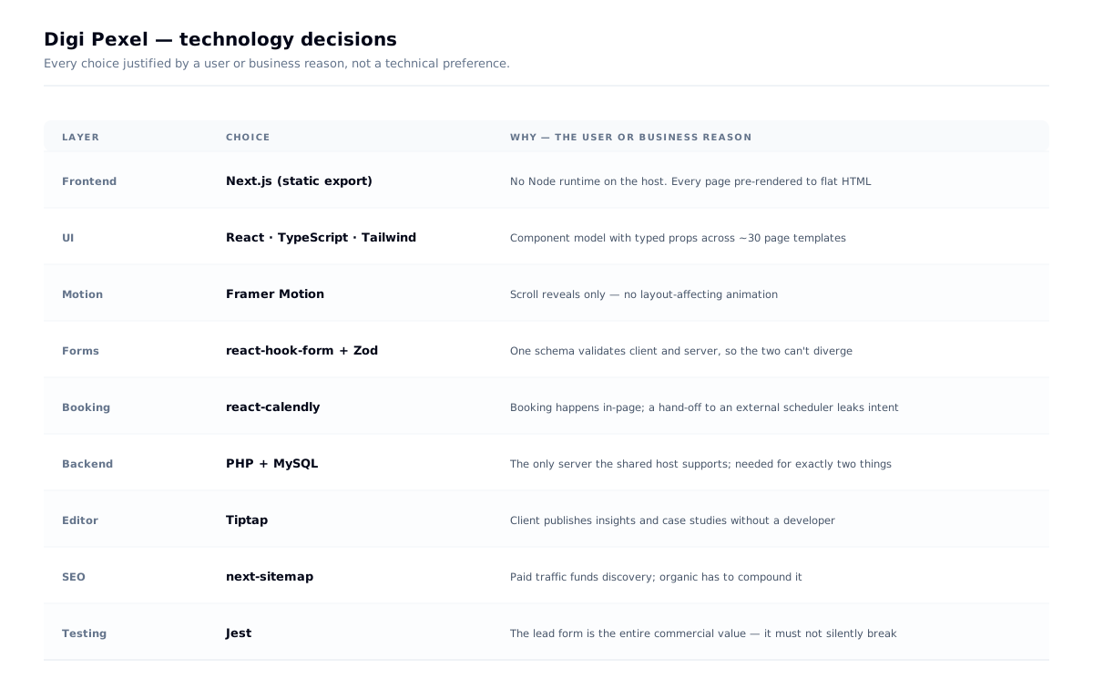
Tech decisions, and why
| Choice | Why |
|---|---|
| Leaving WordPress | On the same shared hosting, a pre-rendered static build serves flat HTML while a page-builder WordPress install runs PHP and a plugin stack on every request. The old site's broken counters were also a plugin-configuration failure — the class of fault that disappears when the number is either in the markup or absent. |
| Next.js static export | No Node runtime available; the content is static; paid and organic traffic both need fast, indexable HTML |
| PHP + MySQL API | The only backend the host supports, and the site needs a server for exactly two things |
| react-hook-form + Zod | The single conversion event is a form. Validating on a shared schema means the error a user sees and the rule the server enforces can't diverge |
| react-calendly | Booking happens in the page. Sending a cold lead to an external scheduler is a hand-off where intent leaks |
| Tiptap | Client publishes insights and case studies without a developer |
| next-sitemap | Paid traffic funds discovery; organic has to compound it |
| Jest | Unusual on a marketing site, but the lead form is the entire commercial value of the project — it's the one thing that must not silently break |
Outcome
- A live, fully static marketing site with 7 service lines, insights and work sections
- One conversion path, instrumented end to end, with in-page booking
- A CMS the client publishes from without a developer
- An architecture that runs on shared hosting with no runtime cost
- Delivered solo over six weeks
Engagement after launch
Third-party estimate, July 2026:
The number I'd point at is the bounce rate. 36.5% is low for a marketing site, and on cold outreach traffic — visitors with no prior brand exposure and every reason to leave — it's the metric that most directly tests the design decision this project was built on: establish the problem before naming the service.
The short session length is consistent with the intent rather than against it. The homepage was written to be read in under a minute, with one ask and no content designed to hold anyone. A visitor who reads it and books a call should produce a short session.
Estimated third-party data, not analytics-verified — see the note below on how I'd firm this up.
| Monthly visits | 702 |
| Bounce rate | 36.5% |
| Pages per visit | 1.93 |
| Avg. visit duration | 0:49 |
What I learned
Channel changes the argument. Cold traffic needs the problem established before the service is described. Search traffic doesn't. Same company, different page order.
When you can't show the product, show the materials. Six real platform logos proved more than any illustration.
Small honest numbers beat big vague ones. "See our 7 reviews" is a stronger asset than "trusted by hundreds" — because one is checkable and the other is not.
Constraints pick architectures. "No Node runtime" wasn't a limitation to work around — it selected the correct approach.