Cluxn
An IT partner for manufacturers who have already been sold software once, and regret it.
- Role
- End-to-end UX/UI & Development
- Timeline
- 6 weeks
- Status
- Live at cluxn.com
- Platform
- Marketing site + CRM + CMS
- Industry
- Manufacturing IT, international
Project overview
- What it is
- Marketing site + CRM + CMS + email marketing platform
- The company
- Cluxn — an IT partner for manufacturers: websites, ERP, automation and workflows, across 16 industries
- Industry
- Manufacturing IT services, international
- My role
- Sole designer & developer — research, IA, design system, UI, copy, SEO strategy, frontend, backend, admin
- Team
- Solo
- Stack
- Next.js App Router · React · TypeScript · Tailwind · Vite (admin) · MySQL · Tiptap
- Status
- Live at cluxn.com
Who it's for, and how they arrive
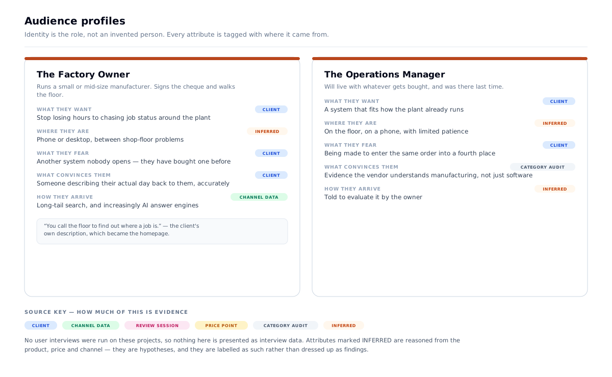
Primary user: a plant owner or plant head at a small or mid-size manufacturer — auto components, industrial machinery, pharma API. Not a CTO. Usually the person who signs the cheque and also walks the floor.
Secondary user: an operations manager who will actually live with whatever gets bought, and whose scepticism is based on the last system that failed.
Where they are: anywhere. Cluxn started as a vendor for Indian MSMEs and has since repositioned as an IT partner for manufacturers, internationally — the structured data now declares areaServed: Worldwide, and nothing in Cluxn's own positioning names a country.
How they arrive: cold outreach is the primary channel — the client approaches owners directly, and the site is where that conversation gets validated. Long-tail organic search and AI answer engines are the compounding second channel, built to reduce the dependence on outreach over time.
The one action: get to a first conversation. The page offers it at two commitment levels. The hero asks directly — "Schedule a consultation", qualified with "30 minutes. You leave with a written plan, whether or not you hire us." The page closes with a smaller ask for anyone not ready: "Tell us what slows your plant down. Four short questions."
The context: desktop or phone, during working hours, between shop-floor problems. Carrying a specific memory of software that didn't work.
The channel is why the homepage diagnoses before it pitches. A cold-outreach visitor has not decided they have a problem, has never heard of the company, and has probably been approached by three other vendors this quarter. They cannot be sold to on arrival — they have to recognise themselves first. That is the entire job of "Sound familiar? Pick your problem."
And it's why the closing ask is four questions, not a calendar link. A 30-minute call is a large commitment from someone who has been burned before. Four questions is small, it can be answered in the moment the recognition lands, and it arrives with the problem already stated — which is worth more to the client than an unqualified slot.
The problem
- This buyer has usually been sold software before, and it failed — an ERP nobody opened, a website that produced nothing
- They do not search for "ERP software." They search the pain
- The head terms are owned outright by SAP, Zoho and the enterprise vendors — unwinnable
- Every competitor site says the same four words: innovative, scalable, end-to-end, transformation
- The real decision is made offline, by someone who wants to know you understand a shop floor
What I had to work with
- A real services business with genuine history, but no differentiated digital presence
- 16 industries × 4 service categories — a large surface with a real cannibalisation risk
- No paid acquisition budget — cold outreach carries the funnel today, and organic has to reduce that dependence over time
- A client team who would run content and leads daily after handover
- A target market that moved after launch — from Indian MSMEs to manufacturers anywhere
Research & definition
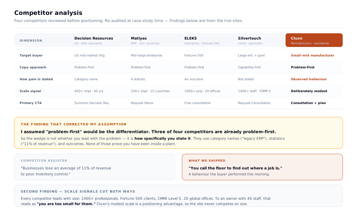
I reviewed four competitors before positioning: Decision Resources (US, Infor specialist, manufacturing), Matiyas (ERP across 15+ countries), ELEKS (enterprise, Fortune 500), and Silvertouch (publicly listed, pan-India).
The finding corrected my assumption. I expected "problem-first copy" to be the differentiator. Three of the four are already problem-first. Matiyas opens with "Businesses lose an average of 11% of revenue to poor inventory control." Decision Resources leads with "Time to Break Free of Your Legacy ERP."
So the wedge isn't whether you lead with the problem — it's how specifically you state it. They use category names, statistics and outcomes. None of those prove you've been inside a plant.
| Their register | What we shipped |
|---|---|
| "Businesses lose an average of 11% of revenue to poor inventory control." | "You call the floor to find out where a job is." |
| A statistic the reader agrees with and forgets | A behaviour the reader performed this morning |
The second finding was about scale. Every competitor leads with size — 1400+ professionals, 2000+ clients, Fortune 500, CMMI Level 5, 20 global offices. To an owner with 40 staff, that reads as "you are too small for them."
Cluxn's modest scale is therefore a positioning advantage, not a weakness to hide. The site never competes on size — no employee counts, no global office map. That was a deliberate omission, made because of this research — and it held when the market went international, because three of the four competitors were already international.
The problem statement this produced
A plant owner who has already bought software that failed will not be convinced by a capability list from a company claiming global scale. Prove you have stood on their shop floor, in their language, on the page they can actually find.
Problems → decisions
| # | The problem | What I decided | Why | What it changed |
|---|---|---|---|---|
| 01 | Category is saturated with abstraction | Write the copy in the customer's words | Naming a specific daily reality proves you've stood in the building | "Sound familiar?" became the homepage's spine |
| 02 | Head terms are unwinnable | Concede them deliberately | Competing with SAP on "ERP software" is lost before it starts | Long-tail, problem-first, one keyword per page |
| 02b | Outreach doesn't compound | Build the organic layer anyway | Every month of content lowers the dependence on cold approach | Full technical SEO, guides, lead magnets |
| 03 | Two discovery channels, one content model | Build for Google and AI answer engines together | Both reward specific, sourced, problem-shaped content | Content model designed for both; AI crawlers allowed by name |
| 04 | A services homepage is usually a menu | Structure it as an argument | A menu asks the visitor to self-diagnose; most won't | Twelve sections: diagnose → prove → prescribe → ask |
| 05 | The market moved from one country to many | De-localise the copy, keep the floor | The pain is universal; the vocabulary around it wasn't | WhatsApp, "factory" and India-specific framing removed from Cluxn's own copy |
| 06 | 16 industries × 4 services will cannibalise | One primary keyword per page | Prevents the site outranking itself | IA and keyword map are the same artefact |
| 07 | Admin is a product, not a CMS | Split it into a separate SPA | Used all day, zero SEO value — no reason to pay SSR cost | Opposite call to Buildera, for a documented reason |
Decision 01 — I wrote the copy in the customer's words
The strongest decision on this project is a copy decision, and it drove the whole homepage.
Instead of a services list, the homepage runs a section titled "Sound familiar? Pick your problem." — four problems, stated the way the client states them:
| Label | The headline | |
|---|---|---|
| 01 | No floor visibility | "You call the floor to find out where a job is." |
| 02 | Software nobody opens | "The same order gets typed into four places." |
| 03 | Buyers cannot find you | "Buyers search online. They find your competitor." |
| 04 | Knowledge in one head | "One person is on leave. The line stops." |
Note the instruction — pick your problem. The section isn't a list of pain points to read past; it's a self-selection mechanism. Each problem ends in a route to its fix — See automation → · See ERP → · See websites → · See workflows → — so the visitor identifies their own situation and the page sends them to the one service that answers it.
Then, and only then, the fix — in the same register:
"Excel, text messages, the ERP, the accountant. One system built around how your plant already runs, entered once."
Why: naming a specific, slightly embarrassing daily reality does something no adjective can — it proves you have stood in the building. The buyer's first question is never what do you sell, it's do you understand my plant.
What I rejected: the capability-led homepage every competitor runs. It reads as a menu and competes on an axis where Cluxn cannot win.
Impact: the hero followed from it — "Websites that win you quotes." Not "digital transformation." An outcome the buyer already wants, in five words.
What I learned: in a category saturated with abstraction, specificity is the differentiator. "Text messages, the ERP, the accountant" is worth more than any claim about scalability, and it costs nothing to write.
Decision 02 — I gave up the head terms on purpose
The keyword strategy's first rule was a concession:
No head terms. "ERP software", "manufacturing software", "IT company" are owned by SAP, Zoho and the enterprise vendors. Do not compete.
| Rule | Why |
|---|---|
| Problem-first | Target the pain, not the solution category |
| Industry-specific | "[industry] + [solution]" beats generic every time |
| Mid-size manufacturer angle | Differentiates from global enterprise players. Originally "India SME angle" — the size angle survived the repositioning; the geography didn't |
| Informational before commercial | Guides build authority; service pages convert |
| One primary keyword per page | Prevents the site competing with itself |
At launch, /services/production-visibility targeted "shop floor visibility software" and "how to track production in real time" — low-competition, high-intent, unmistakably written for one reader. That page has since been retired; the same rule now runs one level deeper, with the automation category split into five single-problem pages — predictive maintenance, demand forecasting, quality automation, supply-chain intelligence, BI — each owning its own query.
The second audience: AI answer engines. A meaningful share of this buyer group now asks ChatGPT, Gemini, Claude or Perplexity directly — and unlike outreach, that channel compounds. Ranking in a generated answer needs the same thing as ranking in Google — specific, sourced, problem-shaped content — so the content model was built to serve both from the start. It's also written into robots.txt, which admits GPTBot, Google-Extended, ClaudeBot, anthropic-ai, PerplexityBot, Amazonbot, CCBot and Bingbot by name under a comment that says exactly why: "AI Crawlers — allow for AI visibility."
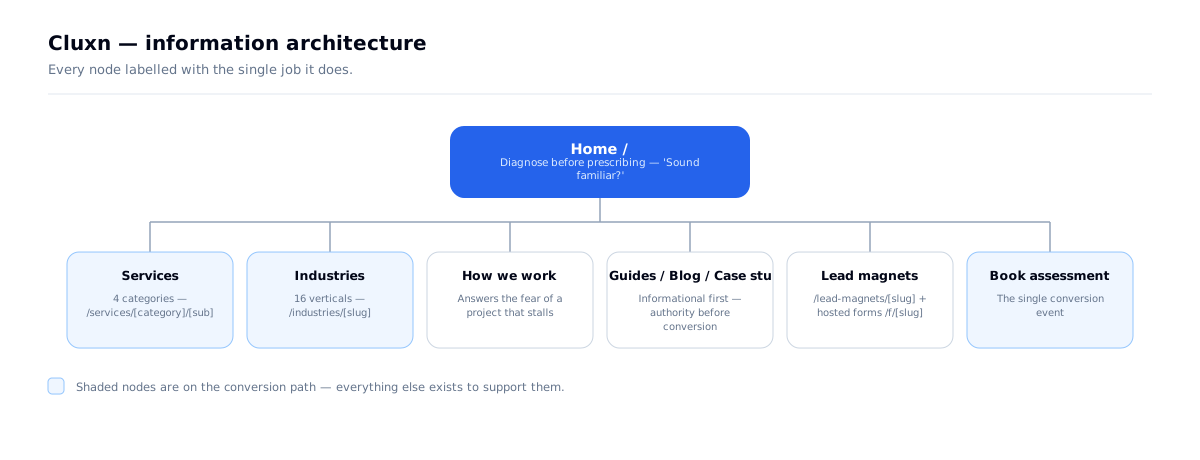
The design consequence: this is why the site has /industries/[slug], /services/[category]/[sub], /guides, /case-studies and a search page. The information architecture is the keyword strategy made navigable. IA and SEO were one decision, made once — and the live sitemap still carries it: 59 URLs, of which 16 are industries and 22 are services.
Decision 03 — The homepage is a sequence, not a stack
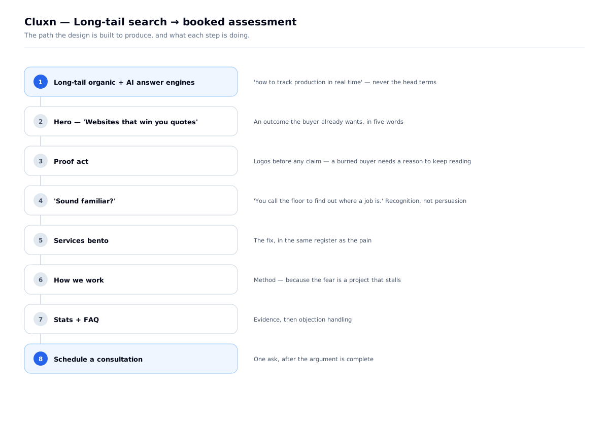
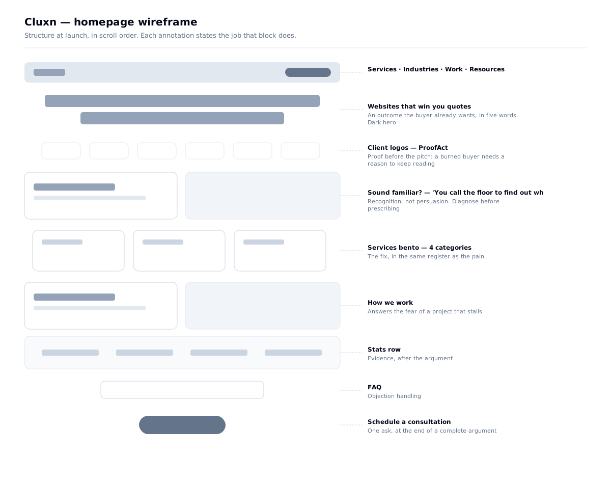
The homepage is twelve sections, and each has a job in an argument rather than a slot in a menu:
| # | Section | Its job |
|---|---|---|
| 1 | Hero — rotating headline, four capability chips, a live product mockup, a "Trusted by manufacturers" strip | Promise, and the direct ask |
| 2 | "Sound familiar? Pick your problem." | Pain — the reader recognises themselves |
| 3 | 500+ · 10+ · 16 · 4 wks | Proof, before the pitch |
| 4 | "What we build — Four things." | The fix, in the same register |
| 5 | "One team owns it, end to end. If it breaks, we fix it." | Accountability, stated flatly |
| 6 | "How it works — Three steps. No surprises." | Method, because the fear is a project that stalls |
| 7 | "This is the floor we build for." | A breath — the setting, not a claim |
| 8 | "Proof — Real plants. Real numbers." | Full case studies, by industry |
| 9 | "In their words — What owners say." | Third-party evidence, attributed by name |
| 10 | "Why Cluxn — Four promises." | The guarantee, starting with fixed price |
| 11 | "Before you book — Common questions." | Objection handling |
| 12 | "Start here — Tell us what slows your plant down." | The smaller ask, for anyone not ready to book |
Why it matters: a services homepage usually fails by being a menu, and a menu asks the visitor to self-diagnose. This one diagnoses first, then prescribes. The numbers sit between the pain and the pitch, because a burned buyer needs a reason to keep reading before they'll accept a claim.
Three details worth naming.
The hero headline rotates — and the visitor can steer it. "Websites that win you quotes." · "ERP your team actually uses." · "Automation that catches problems." · "Workflows that run without you." One headline per service line, with the payoff phrase set in italic. One company, four service lines, and no way to know which problem brought the visitor — so the hero cycles the promises every few seconds rather than betting the page on one. Same reasoning as RSG's rotating hero, reached independently on a different project.
The difference here is that the four capability chips under the headline are the controls for it. Click ERP and the headline, and the product mockup beneath it, switch to ERP — the mockup's activity feed changes to "Order #2214 entered once, synced to 3 systems" and "Batch 118 traced in 12 seconds." A visitor who already knows their problem doesn't have to wait for the carousel to reach it. The first headline is server-rendered, so search engines and link previews get a complete sentence, not an empty slot.
The four capability chips name what each thing replaces, not what it is:
| Websites | replaces status calls |
| ERP | replaces paperwork |
| Automation | replaces email chains |
| Workflows | replaces binders |
That is the same specificity strategy as "Sound familiar?", compressed to two words. "ERP" means nothing to an owner who has been sold one before. "Replaces paperwork" is a thing they can picture on their own desk. Naming the displaced object is more concrete than naming the category — and it quietly answers "what do I actually get" before any service page is opened.
Proof got promoted. The first version had one proof beat — a stats row. The current page has three, each harder to fake than the last: numbers (500+ projects, 16 industries), then full case studies filed by industry, then named testimonials — the CEOs of RSG and Falcon Fire Safety quoted by name and title, not "a manufacturing client." For a buyer whose defining trait is having been lied to by a vendor before, an attributable quote is worth more than any claim the site makes about itself. The CTA underneath closes the loop: "Want numbers like these for your plant?"
"Four promises" answers the fear directly, and each is written to be checkable: "Fixed price, in writing" · "One engineer, start to finish" · "You own everything" · "Leave any time" — the last with "a written exit clause and no license fees." The fear isn't that the project fails; it's being trapped in it after it does.
Decision 04 — I went international by deleting words, not adding them
The site launched for Indian MSMEs. The client then moved the target market: manufacturers, anywhere. The obvious response is to add — a global map, a list of countries served, currency switchers, "trusted worldwide." I did the opposite.
The problem cards were already universal. "You call the floor to find out where a job is" is true in Pune, Stuttgart and Ohio. What wasn't universal was the vocabulary around the problems — and that was where the edit went:
| Launch copy | Current copy | Why |
|---|---|---|
| "Excel, WhatsApp, the ERP, the accountant" | "Excel, text messages, the ERP, the accountant" | WhatsApp as the default business channel is regional; "text messages" is not |
| Automation replaces whatsapp | Automation replaces email chains | The universal version of the same pain |
| Websites replaces phone calls · Workflows replaces clipboards | replaces status calls · replaces binders | More specific, and true on any floor |
| "Tell us what slows your factory down" | "Tell us what slows your plant down" | "Plant" is the owner's word in more markets |
| "Book a free 30-min call" · "No pitch. No prep." | "Schedule a consultation" · "You leave with a written plan, whether or not you hire us." | The promise moved from what the call isn't to what you leave with |
| Industry: India MSME | Eyebrow: "IT partner for manufacturers" · schema areaServed: Worldwide | Position on the buyer's trade, not their geography |
What I kept on purpose: the proof. RSG and Falcon Fire Safety are Indian manufacturers, and their case studies still say so. Scrubbing the country out of real client stories to look international would have been exactly the kind of move this buyer has learned to distrust. The positioning is international; the evidence is honest about where it came from.
What I learned: a strategy built on specificity survives a market change better than one built on claims. The claims would all have needed rewriting. The observations of a shop floor needed almost none.
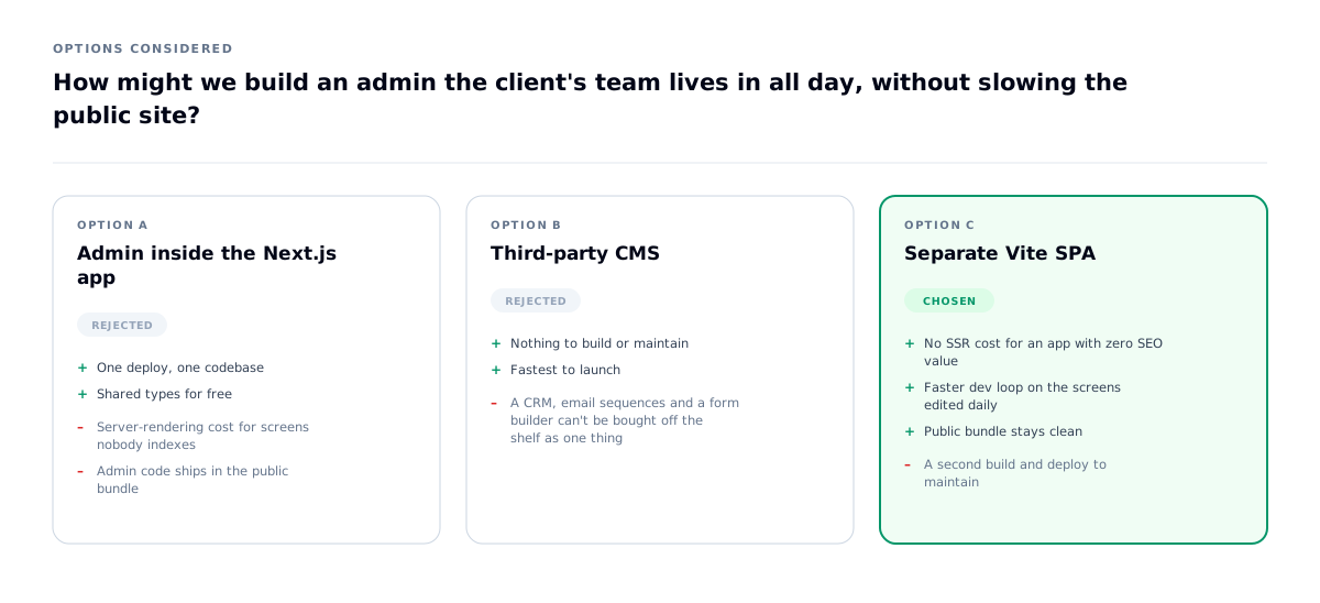
How might we build an admin the client's team lives in all day, without slowing the public site?
The interesting part is that I made the opposite call on Buildera twelve weeks later — same question, different answer, because the admin's scope was different. Cluxn's admin is a product (CRM, sequences, form builder); Buildera's is a CMS. Architecture should follow scope, not habit.
The interface
The launch structure. The live page adds the proof and "floor we build for" sections shown in the table above.
Decision 05 — The redesign: fewer values, flatter surfaces
The launch system was generous: a blue primary, four complete accent themes, six radii chosen by role, a three-step elevation scale with separate dark-mode shadows. It was coherent, and it looked like software. The redesign asked a harder question of every value — does this earn its place? — and most didn't.
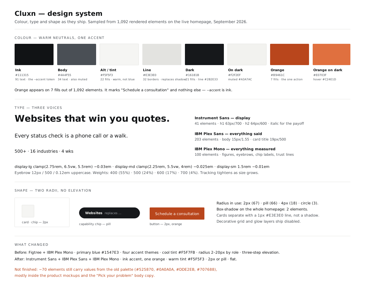
| Launch | Now | |
|---|---|---|
| Type | Figtree + IBM Plex Mono | Instrument Sans (display) + IBM Plex Sans (body) + IBM Plex Mono (measured) |
| Accent | Blue #1547E3, plus four accent themes | Ink #111315 as the accent token; one orange #B9461C for the action |
| Surfaces | Cool blue-grey #F5F7FB, blue tint #E6F0FF | Warm neutral #F5F5F3, line #E3E3E0 |
| Dark ground | #0A0E1A with an aurora gradient | Flat #16181B — the glow and grid layers ship disabled |
| Shape | tag 2 · control 6 · chip 8 · element 12 · card 14 · panel 20px | 2px for cards, buttons and chips (67 uses) · pill for capability chips (66) |
| Depth | Three-step elevation + glow | Flat. Two elements on the whole homepage carry a shadow; cards separate with a 1px line |
Why warm and why rust. Every enterprise software vendor in this category is blue, and the launch site was too. Blue says software company. The redesign moves the palette toward the materials of the buyer's own building — off-white paper, graphite ink, a rust orange that reads as oxide on steel rather than a SaaS button. It's a palette an owner would see on their own floor, which is the same argument the copy makes.
Orange means one thing. It appears on 7 fills out of 1,092 rendered elements, and every one of them is Schedule a consultation. The design token called --accent isn't orange at all — it's ink. Emphasis, secondary buttons and hover states are all graphite; orange is reserved for the single action the page exists to produce. When a colour means only one thing, the eye learns it in one screen.
The one idea that survived from the old system. Every accent used to carry two values — one for a light ground, one for a dark panel — because a single value is always either too light on white or too dark on the panel. The redesign cut the accents from four to one, but kept the split: #B9461C on light, #E0703F on dark. Four extra tokens became one, and the class of bug they prevented is still prevented.
Three voices
Instrument Sans for what's announced (41 elements — headlines, with the payoff phrase in italic). IBM Plex Sans for everything said (203 elements). IBM Plex Mono for everything measured (100 elements — every figure, eyebrow, chip label and trust line).
The launch system had two voices, and the mono split was its best idea: a stat set in mono reads as an instrument readout rather than a marketing claim. That idea stayed. What changed is that the headline got its own voice — Instrument Sans at 63–64px, tracking tightening as size grows — so the page can say something loud without borrowing the body face and inflating it.
| Token | Value |
|---|---|
display-lg | clamp(2.75rem, 6.5vw, 5.5rem) · −0.03em · 700 |
display-md | clamp(2.25rem, 5.5vw, 4rem) · −0.025em · 700 |
display-sm | 1.5rem · −0.01em · 600 |
card-title | 19px / 500 · −0.01em |
card-body | 15px / 1.55 |
eyebrow | 12px / 500 · 0.12em · uppercase |
Weights on the live page: 400 (55%) · 500 (24%) · 600 (17%) · 700 (4%) — bold is scarce enough to still mean something.
Two decisions about things that are not text
Decorative illustrations are hidden from screen readers. The product mockups — fake browser chrome, mock SKU tables, status chips reading "all systems active" — are a picture of an interface, not an interface. 93 elements carry aria-hidden="true". Reading a fake SKU row aloud would interrupt the real card title with decorative fragments. The same logic as alt="" on a decorative image, applied to markup.
Motion has a fallback. Under prefers-reduced-motion: reduce, every CSS animation and transition is cut to 0.01ms and runs once, and the two JavaScript timers — the rotating headline and the mockup's activity feed — check the same media query and don't start. The headline stays on its first line, and the chips still switch it on click. Motion is the presentation, never the carrier: the homepage's copy is in the server-rendered HTML before any script runs.
What isn't finished
The migration isn't complete, and I'd rather say so than have a reviewer find it. Around 70 rendered elements still carry values from the launch palette — #525870, #0A0A0A, #DDE2EB, #707688 — mostly inside the product mockups, plus an arbitrary text-[#707688] on the "Pick your problem" body copy and the old #0A0E1A on the header over the hero. None of them break contrast; all of them are values the new system doesn't contain. A redesign isn't done when the new tokens exist — it's done when the old ones are gone.
The admin — where the real work went
The marketing site is roughly a third of this project. The rest is a platform the client's team runs daily, and it's where most of the engineering effort went.
| Area | What's in it |
|---|---|
| CRM | Leads, contacts, Kanban pipeline, duplicate detection, bulk actions, deal value, analytics, import/export |
| Content | Blog, case studies, guides, lead magnets, authors, categories, media library, Tiptap with image cropping |
| Workflow | Status board, schedule calendar, review + approval, anchored comments, revisions |
| Broadcasts with approval, sequences with channel/segment targeting, subscribers, preferences | |
| Forms | A form builder with hosted /f/[slug] and embeddable mini-forms |
| SEO | Meta, redirects, robots, sitemap, scripts, 404 log |
| Ops | Meetings, webhooks, users, audit log |
Three decisions inside it:
Anchored comments on content. Review feedback attaches to a position in the document rather than living in a separate thread. Detached feedback ("para 3 is unclear") costs the writer a search every time. You only build this if you've watched someone use the tool.
A 404 log, not just a redirects table. Redirects let you fix a broken URL; the log tells you which URLs are breaking. One is a tool, the other is the reason to open it. It matters most in a redesign: when the navigation changed, /lead-magnets was redirected to /guides and /work to /case-studies, so old links kept working.
An audit log from early on. Multiple people edit content and leads — without a record of who changed what, the first disagreement is unresolvable, and adding it retroactively means the history you most need is the history you don't have.
What I learned: for a services business, the website is the shop window but the CRM is the business. Designing only the part that looks good in a portfolio would have been the less useful half of the job.
The decision that passed every check and was still wrong
At launch, a mega-menu opened over the dark hero. Every contrast ratio inside it passed comfortably:
| On `#FFFFFF` | ||
|---|---|---|
Item title #1C1B21 | 17.10 | pass |
Item link #0A0A0A | 19.80 | pass |
Description #525870 | 7.03 | pass |
Eyebrow #1547E3 | 6.90 | pass |
No violation. Nothing to fix, by any automated measure.
But it was uncomfortable to use. The panel was 800×576px of pure white opening instantly over a
#0A0E1A hero — a 221× jump in relative luminance across a large area, on hover. For an
audience that skews 50+ and often browses in the evening, that is a real problem that no
accessibility checker will ever report, because WCAG has no rule about luminance change.
The first fix was a patch. I dimmed the panel to #F5F7FB, added a 140ms fade (skipped under reduced motion), and replaced a dark shadow that was doing nothing on a dark hero with a light rim. Readability was effectively unchanged; the flash softened.
The redesign removed the cause. The navigation is now four items — Services, Industries, Work, Resources — two of them plain links. There is no 800px panel left to flash. The header itself stays dark over the hero and turns light on light sections, so it never becomes the brightest thing on a dark screen.
What I learned: an automated pass is a floor, not a finish line. The rule that caught this wasn't in any checker — it was noticing that the panel is enormous, the hero is nearly black, and the audience is older than me. And the better fix was not a dimmer panel but a smaller menu.
Instrumentation — matched to the channel, not copied from a checklist
The acquisition strategy is organic search plus AI answer engines, and the buyer is a B2B decision-maker. The tracking follows from that rather than from a default list:
| What's installed | Why this one |
|---|---|
GTM GTM-K5LBW8SJ | The client adds tags without a redeploy — GA4 and LinkedIn both load through it |
GA4 G-2YV2YKP65C | Sessions, sources, and the consultation-booking conversion |
| LinkedIn Insight Tag | The only channel where this buyer can be reached again by role and company size — a manufacturing decision-maker is addressable on LinkedIn in any market, and not on Meta |
| Microsoft Clarity | Session recordings and heatmaps. Left out at launch on purpose — recordings mean little before there's traffic to form a pattern — and added since |
The technical SEO is the strategy made real, and it's checkable: ~190KB of server-rendered HTML, a meta description, six Open Graph tags, a Twitter card, a canonical, JSON-LD for WebSite, Organization + ProfessionalService and FAQPage, a live robots.txt and sitemap.xml, and exactly one <h1> per page.
That last set matters more here than on any other project in this portfolio. The whole plan was to win long-tail queries and be quotable by AI answer engines — and both depend on structured, server-rendered, machine-readable HTML. The FAQ block is the clearest example: the four questions a buyer asks before booking are on the page for the reader, and in FAQPage markup for the machine, from the same source. A client-rendered site would have made the strategy impossible to execute regardless of how good the content was.
Tech decisions, and why
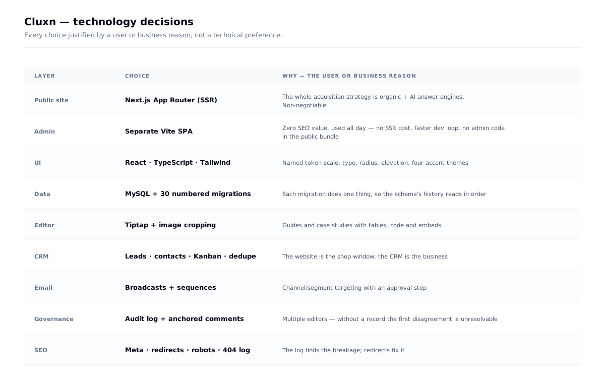
The one worth calling out — I split the admin into a separate Vite SPA here, and on Buildera I did the opposite.
| Cluxn | Buildera | |
|---|---|---|
| Admin scope | CRM, sequences, form builder, workflow, audit — a product | Content, leads, SEO — a CMS |
| Daily users | A team, all day | A small team, occasionally |
| Right call | Separate SPA — no SSR cost for screens nobody indexes, faster dev loop, no admin code in the public bundle | One app — shared types, one deploy |
The point isn't that one architecture is better. It's that the same designer made opposite calls twelve weeks apart because the admin's scope was different.
The public site stays on Next.js App Router because the entire acquisition strategy is organic search and AI answer engines, both of which need server-rendered HTML. That was the one non-negotiable technical requirement, and it followed from the SEO strategy rather than from preference.
Outcome
- A 16-industry, 4-service-category site — 59 indexed URLs — with guides, case studies and search, server-rendered for organic and AI discovery
- A complete CRM and content platform the client operates without a developer
- A repositioning from India MSME to international carried by editing the copy, not rebuilding the site
- A redesign from a blue, four-accent, six-radius system to warm neutrals, one action colour and two radii — with the unfinished edge of the migration documented, not hidden
- Delivered solo over six weeks — the largest project in this portfolio
What I learned
Specificity beats sophistication. "You call the floor to find out where a job is" outperforms any amount of polish, because it proves presence.
Specificity also travels. When the market went international, the claims would have needed rewriting. The observations of a shop floor needed almost none — only the words around them changed.
Conceding a fight is a strategy. Giving up head terms to the enterprise vendors wasn't losing — it was the decision that made the rest winnable.
IA and SEO are one decision. Building the URL structure from the keyword map meant never having to reconcile them later.
A redesign is a subtraction test. Four accents became one, six radii became two, three shadow steps became none. The page got calmer and the one orange button got louder.
A passing audit is a floor. The mega-menu passed every contrast check and was still uncomfortable to use. Luminance change isn't in any ruleset — you have to look at the thing.