Buildera
Three ways of describing the same company, and a visitor who only needs one of them.
- Role
- End-to-end UX/UI & Development
- Timeline
- 6 weeks
- Status
- Live at buildera.co
- Platform
- Marketing site + CMS + lead management
- Industry
- IT services
Project overview
- What it is
- Large marketing site + CMS + lead management, in one application
- The company
- Buildera — an established IT services firm: custom software, Salesforce, DevOps, AI agents, dedicated dev teams
- Industry
- IT services / software consulting
- My role
- Sole designer & developer — IA, design system, UI, copy structure, frontend, backend, admin
- Team
- Solo
- Stack
- Next.js (App Router) · React · TypeScript · Tailwind · shadcn/Radix · MySQL · Tiptap · Resend · jose
- Status
- Live at buildera.co
Who it's for, and how they arrive
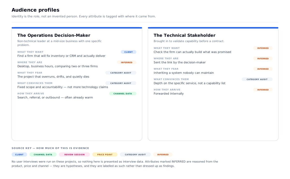
Primary user: a decision-maker at a mid-size business — often non-technical — who has a specific operational problem (inventory is a mess, the CRM doesn't fit) and is looking for a firm that can build a fix and actually deliver it.
Secondary user: a technical stakeholder validating capability, and a procurement reader checking the firm is real.
How they arrive: organic search, referral and outbound. Unlike Digi Pexel's purely cold traffic, a meaningful share arrive warm — via referral or a direct recommendation — and are checking whether the company matches what they were told.
The one action: Book a free discovery call.
The context: desktop, business hours, comparing two or three firms, and specifically scanning for evidence of accountability — because the category's known failure is the project that overruns and stalls.
The channel insight that shaped the whole site: a warm visitor arrives with a specific problem already in mind. They don't want to browse a capability list — they want to find their exact situation and see it named. That requirement produced the site's central design problem.
The problem
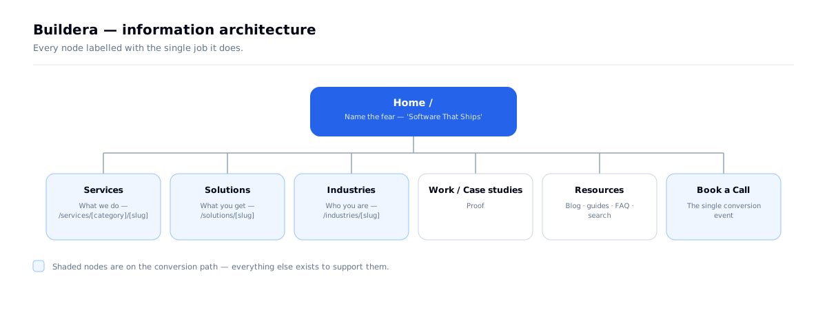
- The company can be described three different ways, and all three are legitimate: services (what we do) · solutions (what you get) · industries (who you are)
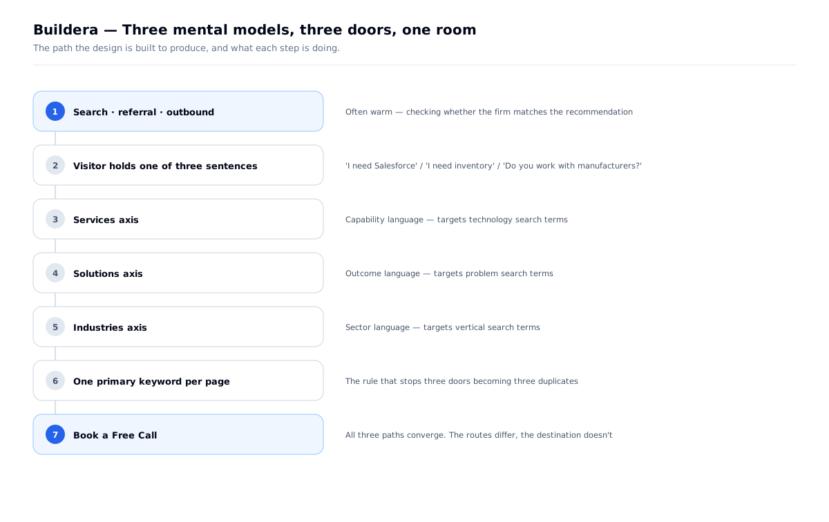
- Visitors arrive holding different mental models — one thinks "I need Salesforce," another thinks "I need inventory management," another thinks "who works with manufacturers?"
- Six services × sixteen solutions × eight industries is a combinatorially large site
- Overlapping taxonomies cannibalise each other in search and duplicate content
- The category's core fear is the project that never ships — accountability has to be visible, not claimed
The design problem: let three different mental models each find their own way in, without the three competing with each other, splitting search authority, or making the site feel like a maze.
What I had to work with
- An established firm with real history (10+ years, a large project count) — credibility was available, unlike Digi Pexel
- A wide, genuinely overlapping service catalogue that could not be simplified away — the company really does all of it
- No dedicated design system or brand assets to start from
- A single conversion goal and a large surface area to funnel through it
Research & definition
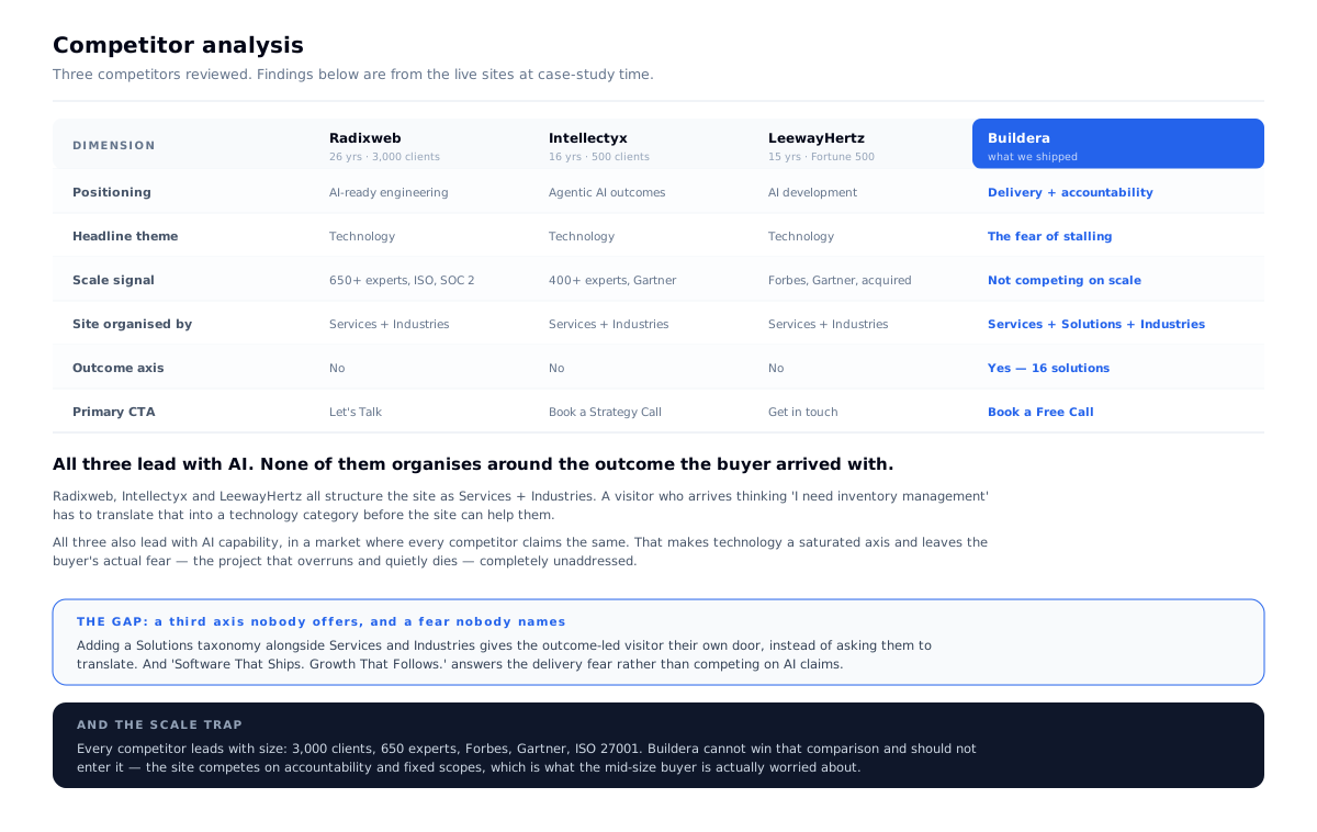
I reviewed three firms competing for the same mid-market buyer: Radixweb, Intellectyx and LeewayHertz.
Two findings, and they pointed the same way.
All three organise the site as Services + Industries. Not one offers an outcome axis. So a visitor who arrives thinking "I need inventory management" has to translate that into a technology category before the site can help them — and most won't. That gap is the entire argument for adding a third taxonomy.
All three lead with AI capability. Radixweb: "Engineering Modern, AI-Ready Systems." Intellectyx: "Accelerate business outcomes with Agentic AI." LeewayHertz: "AI development company." In a market where every firm claims the same capability, technology is a saturated axis — and the buyer's actual fear, the project that overruns and quietly dies, goes completely unaddressed by all three.
The scale trap. Every competitor leads with size: 3,000 clients, 650 experts, ISO 27001, Forbes, Gartner. Buildera cannot win that comparison and shouldn't enter it. The site competes on accountability and fixed scopes instead — which is what a mid-size buyer is actually worried about.
The problem statement this produced
Three competitors, one taxonomy, and the same AI claim. The buyer's real fear — will this ship — is unaddressed by all of them. Give each mental model its own door, and name the fear in the headline.
Problems → decisions
| # | The problem | What I decided | Why | What it changed |
|---|---|---|---|---|
| 01 | Three overlapping taxonomies | Keep all three as separate entry paths, converging on one CTA | Each matches a real mental model; collapsing them would lose two of three visitors | /services/[category]/[slug], /solutions/[slug], /industries/[slug] |
| 02 | Taxonomies compete in search | One primary keyword per page, with distinct page intent per axis | Prevents the site outranking itself | Services target capability terms, industries target sector terms, solutions target problem terms |
| 03 | Client specified shadcn, and "keep it simple" | Work inside the constraint rather than override it | Their next developer inherits a library they already know, not my bespoke system | Design effort redirected from components to IA |
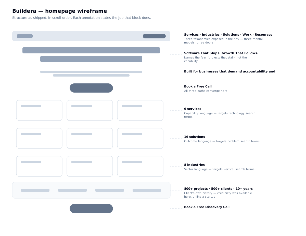
| 04 | Category fear is "it won't ship" | Put accountability in the headline | Names the buyer's actual fear instead of claiming innovation | "Software That Ships. Growth That Follows." |
| 05 | Admin needed, but Cluxn's split didn't fit | Keep admin inside the same Next.js app | One deploy, shared types, no second build for a smaller team | Route groups + API routes, not a separate SPA |
Design principles, set before any screen
- Never make the visitor translate. If they think "inventory", don't force them to think "ERP".
- One primary keyword per page. The site must never compete with itself.
- Name the fear, not the capability. The category's failure is projects that stall.
- Spend the time on navigation, not on buttons. This is an IA problem, not an expressive one.
How might we let three different mental models each find their own way in?
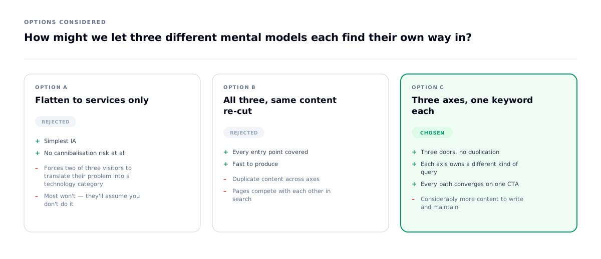
The instinct with overlapping taxonomies is to pick one and flatten the others. I kept all three, because each corresponds to a real sentence a buyer says:
Why not flatten: a services-only site forces the inventory-problem visitor to translate their problem into a technology category. Most won't — they'll assume you don't do it and leave. Making the visitor translate is where you lose them.
The rule that stops them competing: each axis owns a different kind of query. Services target capability terms, industries target sector terms, solutions target problem terms. One primary keyword per page, and no two pages target the same one. Overlapping content with distinct intent — that's the difference between three doors and three duplicates.
All three converge on the same CTA. The paths differ; the destination doesn't.
What I learned: when a business genuinely has several identities, the IA's job is not to choose one. It's to make each path feel like the main one to the person on it.
| Axis | The visitor's sentence | Page shape |
|---|---|---|
| Services | "I need Salesforce work." | Capability — what we do, how we work, proof |
| Solutions | "I need inventory management." | Outcome — the operational problem and its fix |
| Industries | "Do you work with manufacturers?" | Context — sector-specific understanding and examples |
Decision 01 — A client constraint, and what I did inside it
The client asked specifically for shadcn, and for the build to stay simple. That's a legitimate request from a firm that will own this codebase after I leave — a widely-used component library means their next developer already knows it, and it removes the risk of inheriting one person's bespoke system.
So the visual system wasn't the space I had to work in. The information architecture was — and that turned out to be where this project's real problem was anyway.
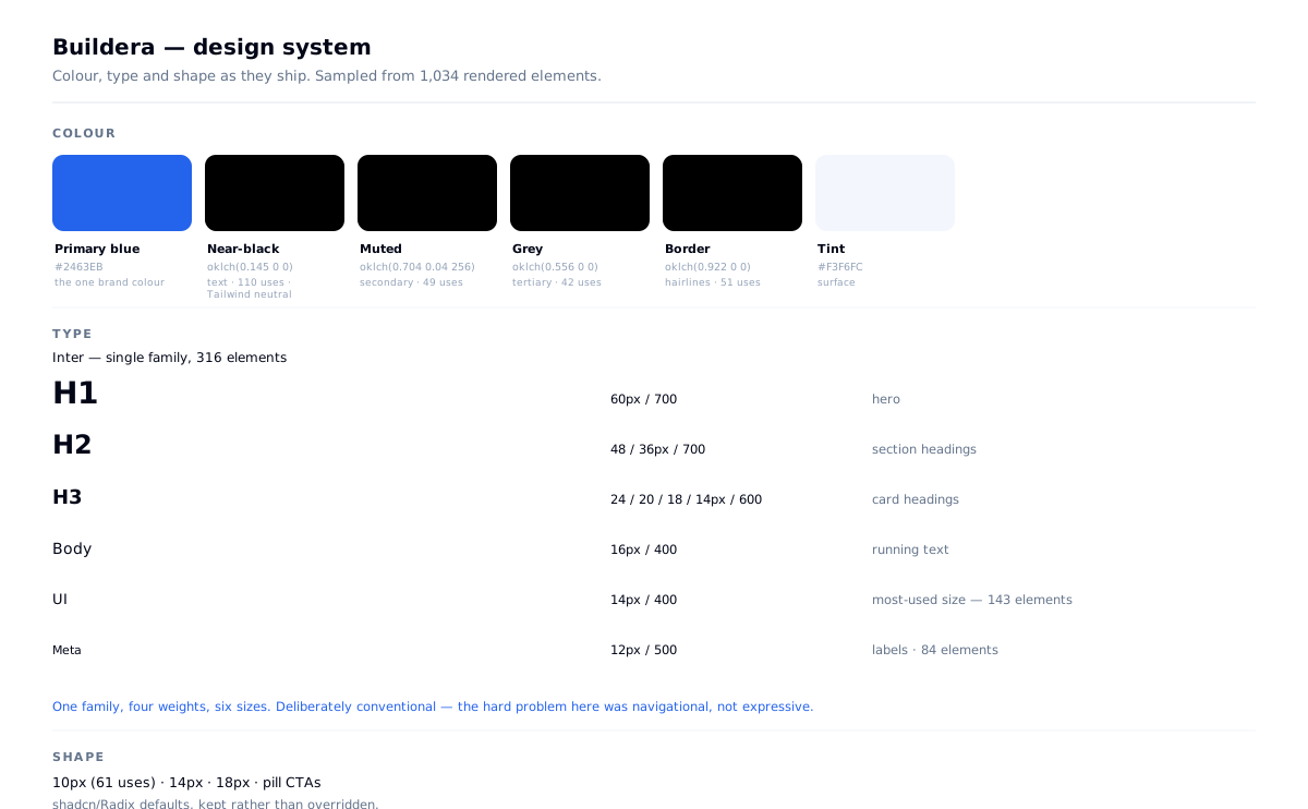
Sampled from the live DOM across 1,034 elements:
Those oklch values are Tailwind v4's own default scale. The palette is stock neutrals plus one brand blue.
Type: Inter, single family, 316 elements. h1 60px/700 · h2 48 / 36px/700 · h3 24 / 20 / 18 / 14px/600. Body scale 14/12/16px. Shape: 10px on 61 elements, 14px, pill CTAs.
Why the constraint was the right call, not just an accepted one. ~50 pages across three taxonomies, one person, six weeks. A bespoke component system would have consumed exactly the time the project needed for IA and content structure — which is where this site lives or dies. shadcn/Radix gave consistent, accessible, keyboard-navigable components on day one, and the freed time went into the three-door navigation problem.
What I did inside the constraint. The library sets the components; it doesn't set the decisions. What's mine here is the single brand blue against an otherwise neutral scale, the type hierarchy, and — the part that matters — the restraint of not fighting the library. Overriding half of shadcn's tokens to make it look custom produces the worst of both: neither a coherent library nor a coherent bespoke system, and a maintenance problem for whoever comes next.
What it costs, honestly: the site looks like competent, current SaaS. It does not look like only Buildera. On a project whose hardest problem is navigational rather than expressive, that's an acceptable price — and it was the client's to set.
Contrast it with RSG, where I built a bespoke navy/orange industrial system from scratch, because there the whole problem was looking more credible than a directory listing — an expressive problem, with no such constraint. Different problem, different answer. The judgement is in knowing which one you have, and in recognising when the client has already decided it for you.
| Role | Value | Note |
|---|---|---|
| Primary blue | #2463EB | the one brand colour |
| Near-black text | oklch(0.145 0 0) | Tailwind neutral |
| Muted / grey | oklch(0.704 …) · oklch(0.556 0 0) | Tailwind neutral |
| Border | oklch(0.922 0 0) | Tailwind neutral |
| Tint surface | #F3F6FC |
Decision 02 — Naming the fear in the headline
"Software That Ships. Growth That Follows." Custom software, Salesforce, AI agents, and dedicated dev teams — built for growth-focused businesses that demand accountability, fixed scopes, and technology that actually ships.
Every competitor in this category claims innovation, scale and transformation. None of those are what the buyer is afraid of.
The buyer's actual fear is the project that overruns, drifts and quietly dies. So the headline is about delivery, and the subhead leads with accountability and fixed scopes — the two words that answer the fear directly.
"Ships" is doing deliberate work. It's a word engineers use about reality, not a word marketers use about ambition.
What I rejected: a capability-led headline listing technologies. It reads as a menu, and it competes with every other firm on the same axis. Naming the fear differentiates faster than naming the skills.
Decision 03 — One application, where Cluxn used two
On Cluxn I split the admin into a separate Vite SPA. On Buildera I kept it inside the same Next.js app, using route groups ((admin)) and API routes.
Why the opposite call:
The point isn't that one architecture is better. It's that the same designer made opposite calls twelve weeks apart because the admin's scope was different. Splitting Buildera's CMS into its own SPA would have added a build, a deploy and a duplicate auth layer for no benefit.
jose handles JWT session auth in middleware; Resend sends transactional email; leads export to CSV because the client's sales process lives in a spreadsheet — meeting them where they are, rather than insisting they work in my admin.
| Cluxn | Buildera | |
|---|---|---|
| Admin scope | CRM, email sequences, forms builder, workflow, audit — a product | Content, leads, SEO, settings — a CMS |
| Daily users | A team, all day | A small team, occasionally |
| Right call | Separate SPA — heavy app, no SEO value, faster dev loop | One app — shared types, one deploy, no second build |
The interface
Three parallel taxonomies, each with its own entry point, all converging on one call to action.
Validation — the same lesson, again
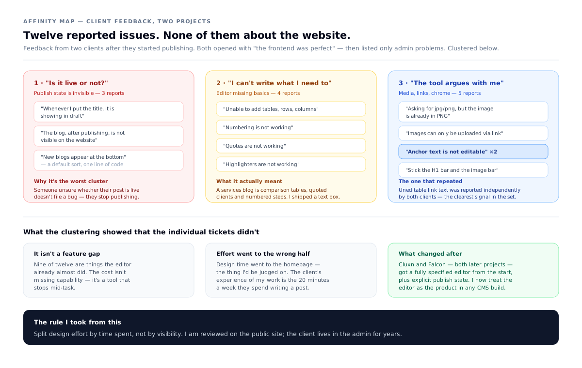
When the client began publishing, their feedback — like Digi Pexel's — contained nothing about the public site. All of it was the editor.
I clustered both clients' reports together rather than treating them as two ticket lists, because the same complaint appearing on two independent projects is a finding, not a bug:
Buildera's own reports:
- Couldn't add tables, rows or columns
- Numbered lists didn't work
- Blockquotes didn't work
- Highlighting didn't work
- Images could only be added by URL, not uploaded
- Internal links weren't editable after insertion
- New posts appeared at the bottom of the list instead of the top
The last one is the most instructive. It isn't a missing feature — it's a default sort order, one line of code, and it meant that every time the client opened the blog list to find the thing they'd just written, it was at the bottom of the page. A trivially small decision that produced friction on the single most repeated action in the whole admin.
The rest cluster into one shape: I shipped a text box, and they needed a writing tool. A services firm's blog carries comparison tables, quoted client language, and numbered process steps — none of which the initial editor supported.
What I changed: extended the editor configuration to cover tables, lists, quotes and highlighting, added direct image upload, made link text editable, and reversed the list sort.
This is the second project where the client's entire feedback was about the admin and none of it was about the site I'd spent the design effort on. Twice is a pattern, not an accident. It's why Cluxn and Falcon — both later — got a properly specified editor from the start rather than a default configuration, and why I now treat the editor as the product in any CMS build.
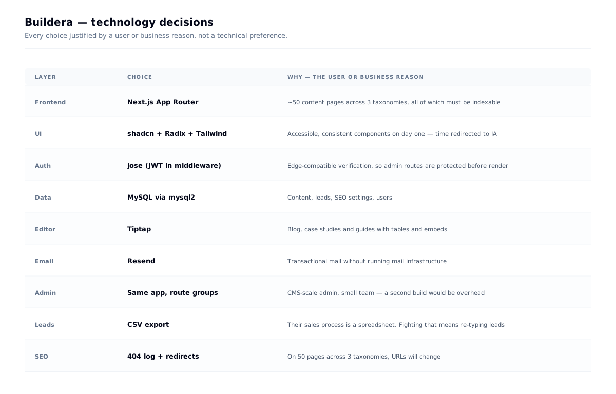
Tech decisions, and why
| Choice | Why |
|---|---|
| Next.js App Router | ~50 content pages across three taxonomies, all of which must be indexable. Search is a primary channel |
| shadcn/Radix | Accessible, consistent components on day one; time redirected to IA. Explicit trade of expressiveness for coverage |
| Admin in the same app | CMS-scale admin, small team, occasional use — a second build would be overhead with no user benefit |
jose for auth | Edge-compatible JWT verification in middleware, so admin routes are protected before rendering |
| Resend | Transactional email without running mail infrastructure |
| Tiptap | Client publishes blog, case studies and guides with tables and embeds |
| CSV lead export | Their sales process is a spreadsheet. Fighting that would mean leads get re-typed |
| 404 log + redirects | On a 50-page site with three taxonomies, URLs will change. The log finds the breakage; redirects fix it |
Outcome
- A ~50-page site across three parallel taxonomies — services, solutions, industries — plus blog, guides, case studies, testimonials, FAQ and search
- Each taxonomy targeting distinct search intent, so the axes don't cannibalise each other
- A CMS with content, media, leads, subscribers, SEO tooling and user management in one deployable application
- Delivered solo over six weeks
What I learned
Don't make the visitor translate. Three mental models needed three doors. Flattening to one would have looked tidier and converted worse.
A component library is a legitimate design decision. On an IA-led project, spending the time on navigation rather than on bespoke buttons was the right allocation — and I can say exactly what it cost.
Architecture should follow scope, not habit. The same admin problem got opposite answers on two projects, twelve weeks apart, for reasons I can defend.
Name the fear, not the capability. "Ships" beat any list of technologies.