AI Findery
Designing a research tool for executives trained not to trust directories.
- Role
- Sole UX & Product Designer
- Timeline
- 4 weeks
- Status
- Live at aifindery.com
- Platform
- Enterprise SaaS
- Industry
- Enterprise SaaS / B2B marketplace
Project overview
- What it is
- Enterprise SaaS product — an AI tool and workflow intelligence platform
- The company
- AI Findery — helps enterprise decision-makers find, compare and deploy AI tools
- Industry
- Enterprise SaaS / B2B marketplace
- My role
- Sole UX & product designer — research, IA, wireframes, prototypes, design system, brand, UI
- Team
- Solo designer, working directly with the founder
- Stack
- Next.js · React · TypeScript · Tailwind
- Status
- Live at aifindery.com
Who it's for, and how they arrive
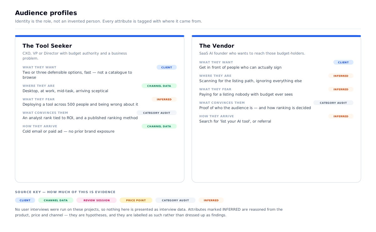
Primary user — the Tool Seeker. A CXO, VP or Director at a mid-to-large enterprise with budget authority and a specific business problem. Time-poor. Makes the final deployment decision and has to defend it internally.
Secondary user — the Vendor. A SaaS AI founder who wants their tool in front of those budget-holders.
How they arrive: cold email and paid ads. Zero prior brand exposure, minimal patience.
The one action: two, through one front door — seekers shortlist a tool; vendors list one. That conflict is the central design problem.
The context: desktop, at work, mid-task, arriving sceptical.
Why the channel governs everything here. A visitor from search has already accepted they need a directory. A cold visitor hasn't — and their prior experience of "AI tool directory" is a SEO-farm affiliate page. So the site has to establish, within seconds, that it is an analyst product rather than a listing site. That single requirement drove the taxonomy, the ranking model and the card design.
The problem
- Established incumbents — Futurepedia, FutureTools, TheresAnAIForThat, Aixploria, Skywork, AIChief — all with more tools, more traffic, more recognition
- All of them built for consumer browsing, not enterprise procurement
- Two audiences with opposing needs on the same page: seekers want less friction, vendors want more visibility
- No existing user base to interview — the product didn't exist
- Enterprise buyers are conditioned to distrust crowd-sourced signals in a procurement decision
What I had to work with
- An early-stage startup: no users, no traffic, no brand
- A target audience that is famously hard to reach for research — inbox-protected and time-poor
- Four weeks, research through shipped UI
- Cold-traffic-only acquisition
- A first design direction the client discarded, which meant re-approaching the visual system while the strategy held
Research & definition
What I want to be straight about: there was no user research on this project. No interviews, no usability tests, no surveys. The product had no users, the founder had no list, and the target audience — CXOs at mid-to-large enterprises — is one of the hardest groups in the world to get an hour from.
I could have run a persona workshop and drawn an empathy map. Both would have been invention dressed as evidence, and neither would have survived a follow-up question in an interview.
What I actually did was desk research. I studied the six established players — Futurepedia, FutureTools, TheresAnAIForThat, Aixploria, Skywork and AIChief — and read their interfaces as evidence of who they were built for. Design decisions always reveal assumptions about the user.
Two patterns did all the work:
1. Every one of them used crowd-sourced star ratings. For a consumer picking a note-taking app, that's useful. For a VP deciding whether to deploy a tool across 500 employees, a five-star average is noise — worse, it manufactures the appearance of validation with no enterprise signal behind it. Procurement buyers are trained to discount exactly that signal.
2. Every one of them required the visitor to already know the technology category before they could filter. None let someone describe a business problem and get matched results.
Both of those are observations about interfaces, not about people — which is the honest limit of what desk research can give you. But both were enough to act on, because both describe a mismatch between how the incumbents are built and how the stated buyer actually decides.
The problem statement this produced
Enterprise buyers are being served consumer-directory patterns — crowd ratings and technology categories — that the procurement process trains them to distrust. Build the analyst product, not the listing site.
What I'd do differently: every design decision here rests on inference from competitor interfaces plus the founder's domain knowledge. With even five conversations with real enterprise buyers, the ranking model in particular would have been grounded rather than reasoned. If I ran this again, getting those conversations would be the first thing I fought for.
Problems → decisions
| # | The problem | What I decided | Why | What it changed |
|---|---|---|---|---|
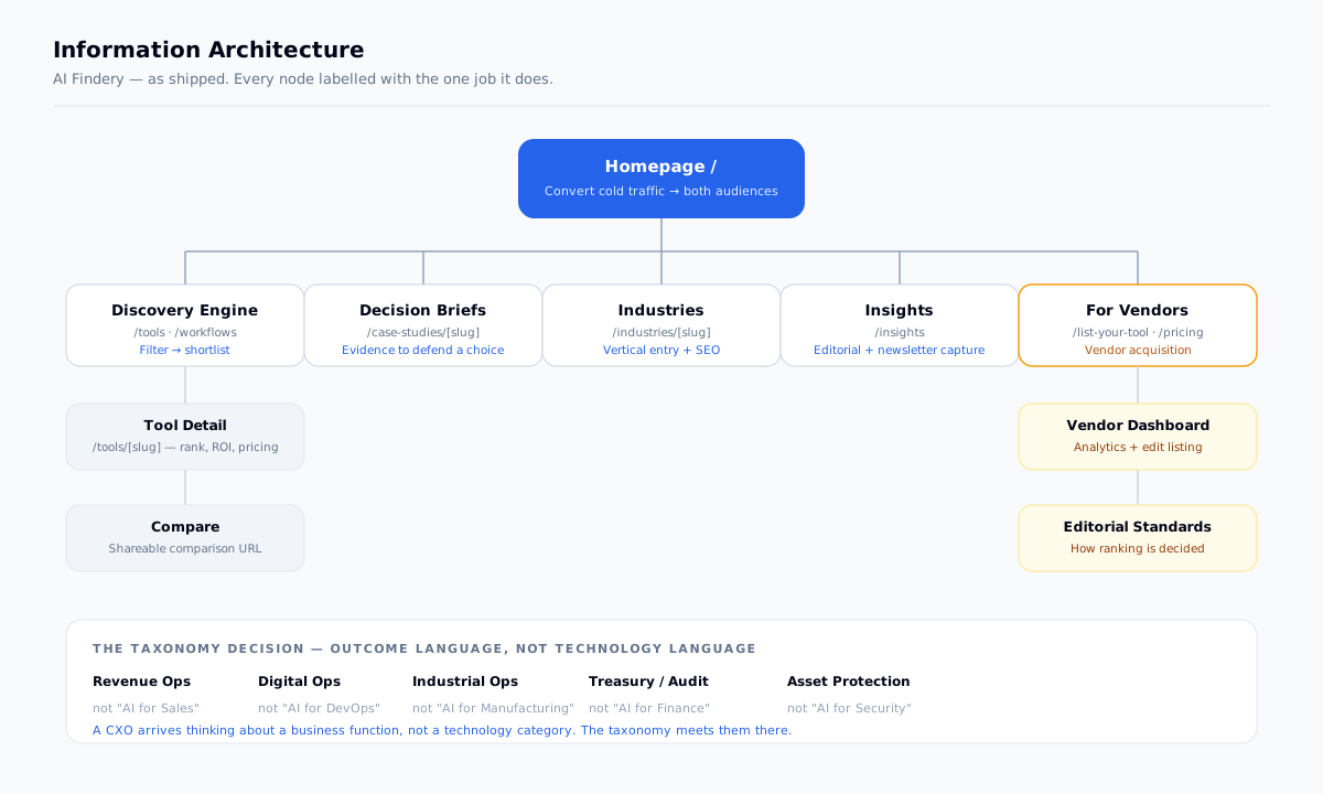
| 01 | Taxonomy written for engineers | Function language, not technology language | "AI for DevOps" tells a CXO this isn't for you | Verticals ship as Revenue Ops · Digital Ops · Industrial Ops · Treasury/Audit · Asset Protection |
| 02 | Star ratings destroy enterprise trust | A numeric analyst rank tied to ROI | Removes the crowd signal buyers discount, keeps a comparable score | Cards show ↗ 5.0 + "Verified ROI", never a five-star row |
| 03 | Directories sort by popularity | Default sort = "Market Rank: ROI Potential" | The default sort is a positioning statement, not a preference | Popularity is not an available sort at all |
| 04 | Tool pages are feature lists | The "Decision Brief" format | A buyer must defend a choice to their team, not read a spec sheet | Case studies ship labelled DECISION BRIEF with verified ROI + performance figures |
| 05 | Two audiences, one entry point | Amber reserved exclusively for vendor paths | One colour, one meaning — vendors self-identify without interrupting seekers | A single dual-CTA band: "Using software?" / "Selling software?" |
| 06 | Ranking invites "how is this decided?" | Publish Editorial Standards + advertiser disclosure | A ranked marketplace that hides its method is an affiliate farm | Both are live, linked in the footer |
Decision 01 — Function language, not technology language
The most consequential decision, and it's a language decision.
Why: taxonomy is the product's most visible intellectual statement — it tells a visitor in one glance who the product was built for. "AI for DevOps" is an engineer's mental model. A CXO doesn't arrive thinking I need a DevOps AI tool; they arrive thinking my ops costs are too high. Every competitor asked them to translate.
Making the user translate is where you lose them.
What I rejected: a hybrid taxonomy exposing both axes. It forced the visitor to choose a mental model before choosing anything else — the opposite of the job.
| What competitors say | What ships here |
|---|---|
| AI for Sales Automation | Revenue Ops |
| AI for DevOps | Digital Ops |
| AI for Manufacturing | Industrial Ops |
| AI for Finance | Treasury / Audit |
| AI for Security | Asset Protection |
Design principles, set before any screen
- Outcome language, never technology language. The taxonomy is the positioning.
- Curated, not comprehensive. For a procurement decision, volume is the problem.
- One colour, one meaning. Amber marks vendor paths and nothing else.
- If you rank, publish the method. Otherwise you're an affiliate farm.
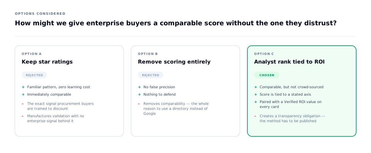
How might we give enterprise buyers a comparable score without the one they distrust?
The hardest constraint: a marketplace needs a comparable score, but the standard score is exactly the signal this audience discounts.
What shipped: a numeric rank presented as a trend chip — ↗ 5.0 — labelled Market Rank: ROI Potential, paired on every card with a Verified ROI value (40% Time Save, High Accuracy, Centralized Ops).
Three things that does:
- No stars, no crowd average. The visual language of consumer review sites is absent entirely.
- The score is tied to a stated axis — ROI potential — rather than undifferentiated sentiment.
- It's editorial. "Analyst Picks — tools our research team recommends this month" makes the source of the judgement explicit.
The obligation it creates: the moment you rank things, both audiences ask how. So Editorial Standards and an Advertiser Disclosure are published and linked in the footer. A ranked marketplace that hides its method is indistinguishable from an affiliate farm — which is the exact thing this product needed to not be.
What I learned: replacing a familiar pattern isn't finished when you remove it. You have to replace the function it served — comparability — and then take on the transparency debt the replacement creates.
Decision 02 — Three facts per card
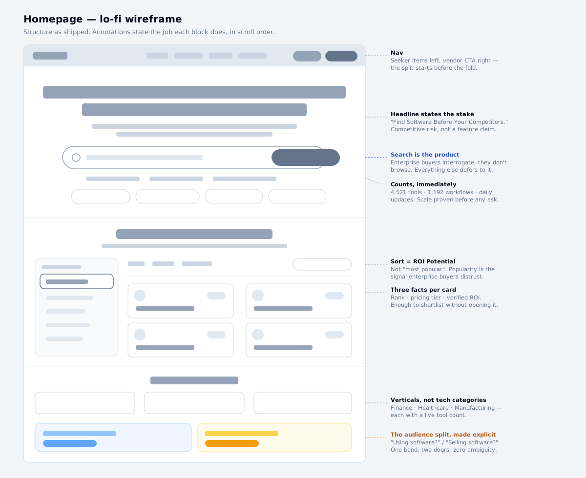
Every tool card carries the same three facts and no more: rank · pricing tier · verified ROI.
Why exactly three: the seeker's job on the grid is to shortlist, not to decide. Three comparable facts let them eliminate most options without opening anything. A fourth adds scanning cost without adding eliminations.
The 191 RECORDS FOUND counter and the left-hand vertical rail with live counts (Revenue Ops 18, Digital Ops 22, Industrial Ops 17) do the same job at the set level: they tell the buyer how much they're looking at before they invest attention in it.
Curated, not comprehensive. A directory's instinct is to prove its size. But for a procurement decision, volume is the problem — the value proposition is that the filtering has already been done.
Decision 03 — One amber signal, one meaning
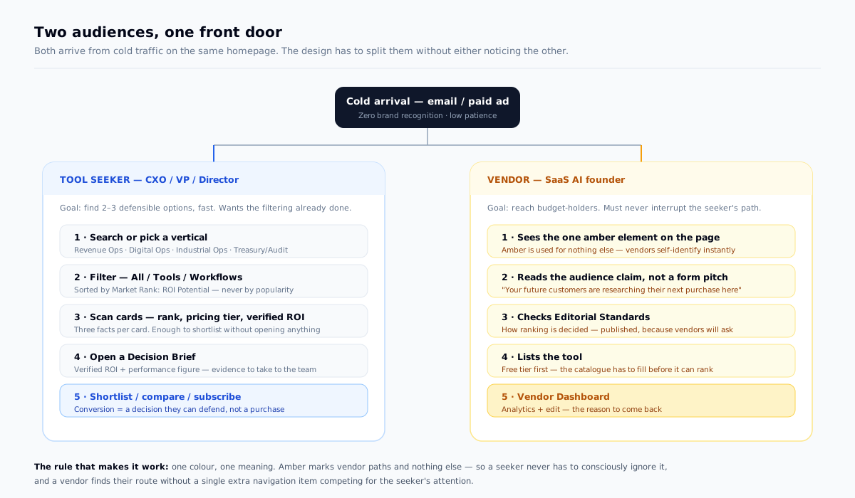
Two audiences, one front door. Vendors need a visible path; seekers must not have to ignore it.
The rule: amber marks vendor acquisition and nothing else — not a highlight, not decoration, not an accent.
A vendor scanning the page finds their route instantly because it's the only thing in that colour. A seeker never consciously filters it out, because it never competes with a primary action.
The copy decision that goes with it: "Submit your tool" is transactional and slightly demeaning. What ships is "Selling software? Reach more buyers — your future customers are researching their next purchase here." It sells the audience, not the form.
And the split is made explicit rather than implied — one band, two doors: "Using software? Leave a review." / "Selling software? Reach more buyers."
The interface
The headline states a stake, not a feature: "Find Software Before Your Competitors." For a cold arrival, competitive risk is a stronger opening than capability.
The search bar is the primary interaction, not a utility in the header — enterprise buyers interrogate rather than browse, so everything above the fold defers to it.
Scale is proven before anything is asked: 4,521 VERIFIED TOOLS · 1,192 WORKFLOWS · DAILY ANALYST UPDATES sits directly under the search field.
Vertical entry points carry live counts — Finance & Fintech 142, Healthcare 87, Manufacturing 92 — so a visitor can judge depth in their sector immediately.
The design system, as shipped
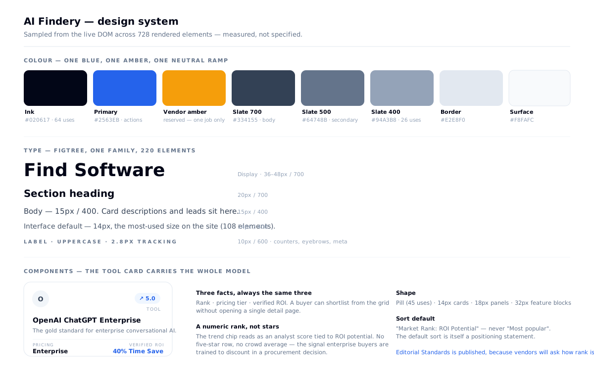
Sampled from the live DOM across 728 rendered elements:
Type: Figtree, and only Figtree — 220 elements. h1 74px/400 · h2 72 / 60 / 48 / 36px/400 · h3 36 / 30 / 24 / 20px. Display weight is 400, not bold — the hierarchy is carried by size alone, which is unusual and worth noticing. Display 36–48px/700 · section 20px/700 · body 15px · interface 14px (108 elements, the most-used size) · labels 10px/600 tracked to 2.8px.
Shape: pill (45 uses) · 14px cards · 18px panels · 32px feature blocks.
Why a slate ramp rather than a brand palette: the product's claim is neutrality — it ranks other people's software. A strongly branded colour system would read as a publisher with a point of view. The restraint is the positioning.
| Role | Value |
|---|---|
| Ink | #020617 (64 uses) |
| Slate ramp | #0F172A · #1E293B · #334155 · #64748B · #94A3B8 |
| Primary | #2563EB |
| Vendor amber | reserved, vendor paths only |
| Surfaces / borders | #F8FAFC · #FFFFFF · #E2E8F0 · #F1F5F9 |
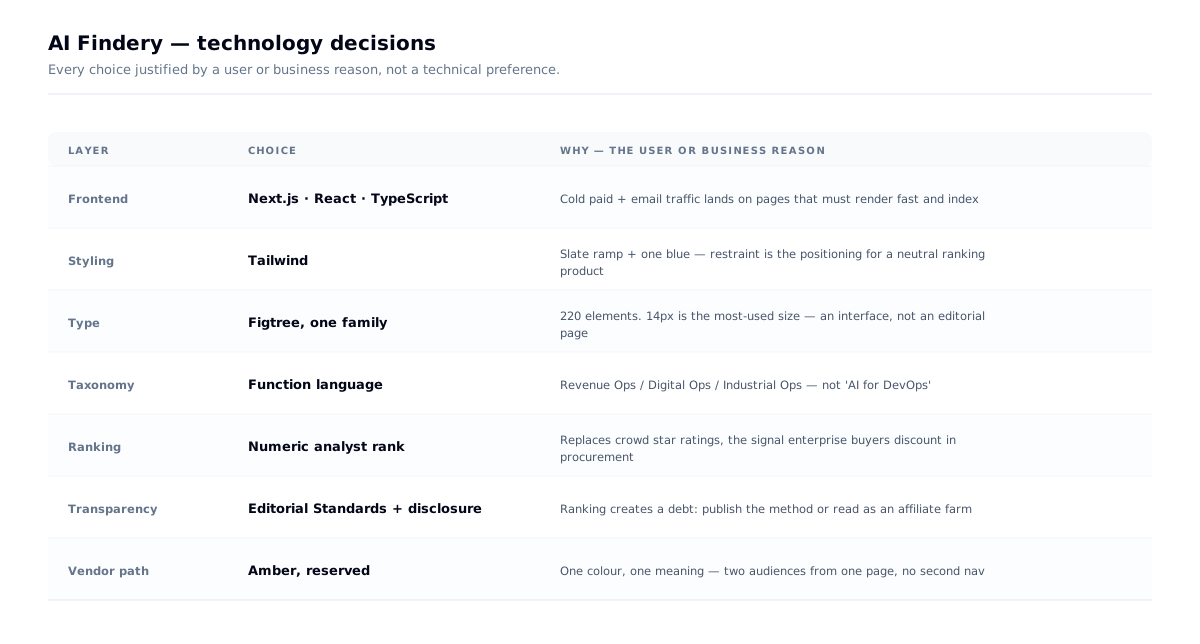
Tech decisions, and why
The one worth calling out isn't a framework choice — it's the decision to publish Editorial Standards. Ranking other companies' software creates an obligation: both audiences will ask how the order is decided, and a ranked marketplace that hides its method is indistinguishable from an affiliate farm. Publishing the method, plus an advertiser disclosure, is what makes the analyst positioning credible rather than claimed.
Outcome
- A live enterprise product taken from blank canvas to shipped in four weeks, solo
- A full research-to-UI trail: competitive matrix, heuristic audit, proxy research, IA, wireframes, design system
- A ranking model that removes the pattern the audience distrusts and publishes the method behind its replacement
- Two conflicting audiences served from one page without a second navigation system
On metrics — deliberately absent. The product was new when I finished, and I haven't fabricated conversion or engagement numbers. What's observable is differentiation: side by side with any incumbent, the product reads as an analyst tool rather than a listing site — which was the entire objective.
What I learned
Taxonomy is design, not copywriting. Moving from "AI for Sales" to "Revenue Ops" did more for positioning than any visual decision.
Removing a pattern creates a debt. Killing star ratings meant owing the user a comparable signal and a published explanation of how the replacement works.
Restricted research makes you rigorous. Not being able to reach the audience forced me to define what each activity was meant to answer before running it.
Reserve a colour and mean it. One amber, one job, served two conflicting audiences from a single page.
A discarded direction isn't wasted. The client rejected the first visual route; the strategy — outcome taxonomy, no crowd ratings, Decision Briefs, the amber rule — survived into what shipped. Strategy that only works in one visual dressing wasn't strategy.